

OVERVIEW
About the project
This is an assignment for the Google UX Certificate Course. As a frequent museum-goer, I chose to design something for the places I deeply love. I decided to use SFMOMA (San Francisco Museum of Modern Art) as an start point as they have great visual identity but the app is very basic.
Team: I was a one-woman band! I finished the project by myself.
Tools Used: Figma, After Effects
Date: 06.2021 - 09.2021
Client: Personal project


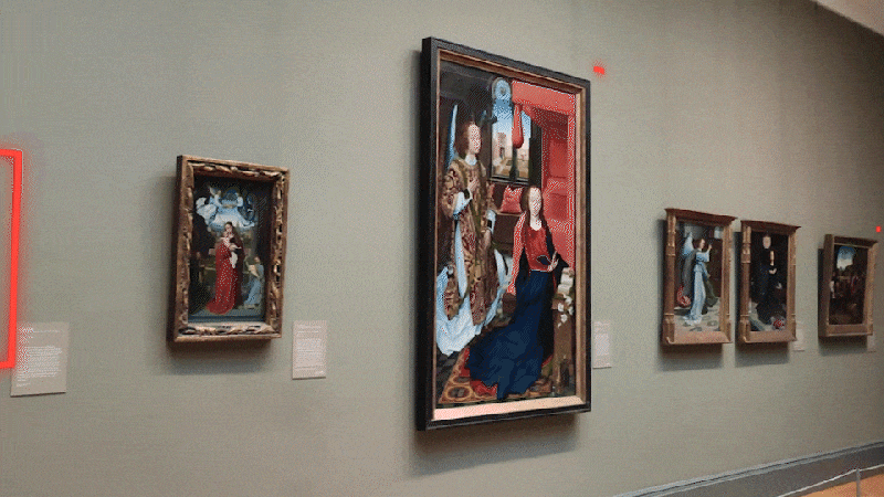
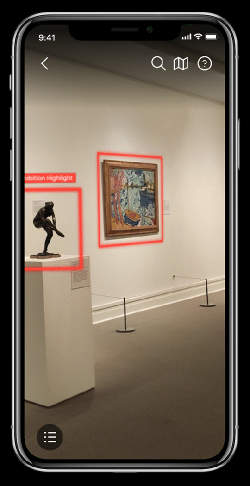
The current version of the SFMOMA audio guide app
Problem Overview:
• Users complain about it's hard to learn about the artworks they are interested in.
• Most museums rely on small labels on the wall but it's not a great user experience.
Solution:
• Skip the label, learn everything on the phone.
• Use AR to recognize the works right away.
• Diversify the content and show an outline of the audio.
• Use AR to recognize the works right away.
• Diversify the content and show an outline of the audio.
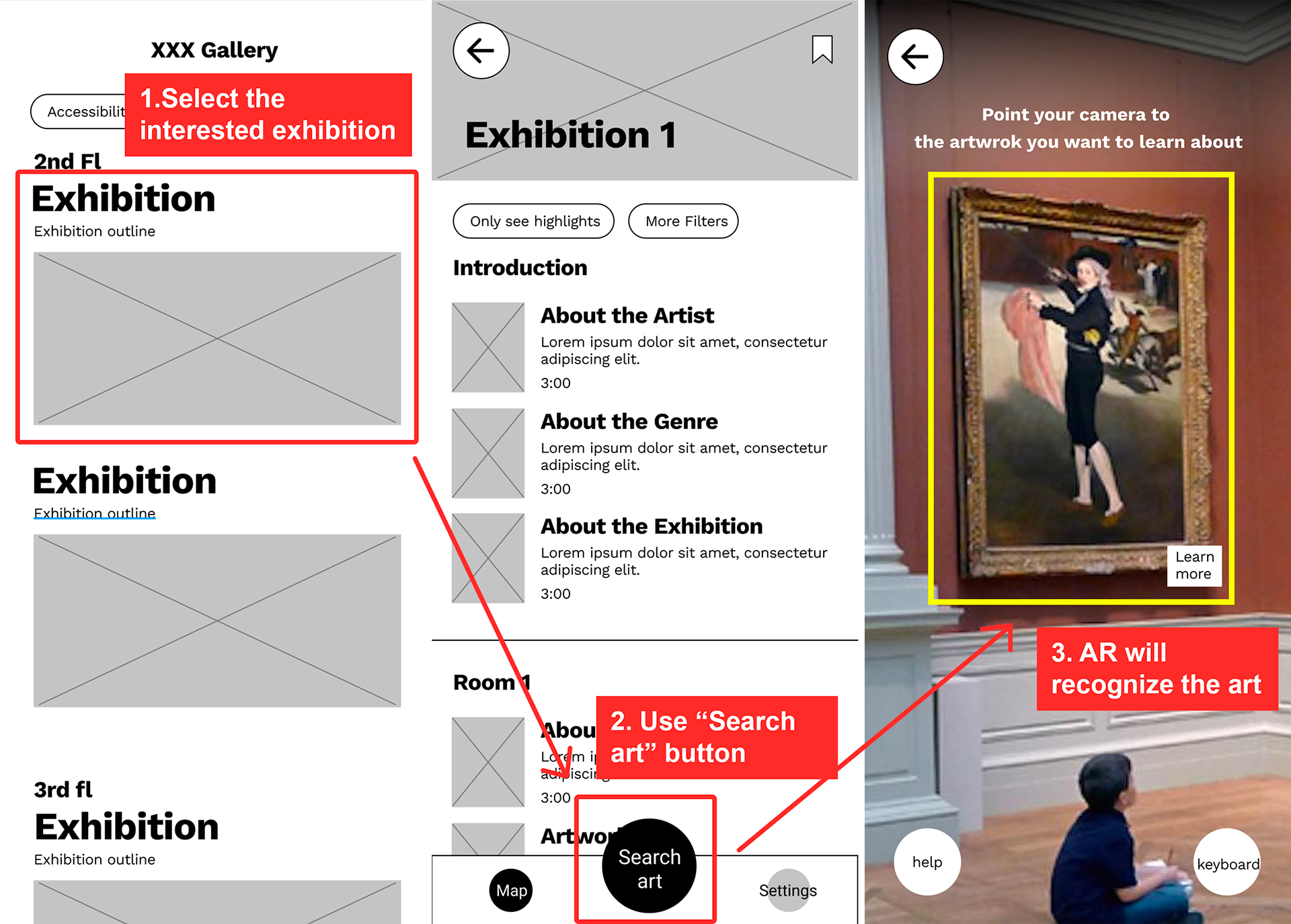
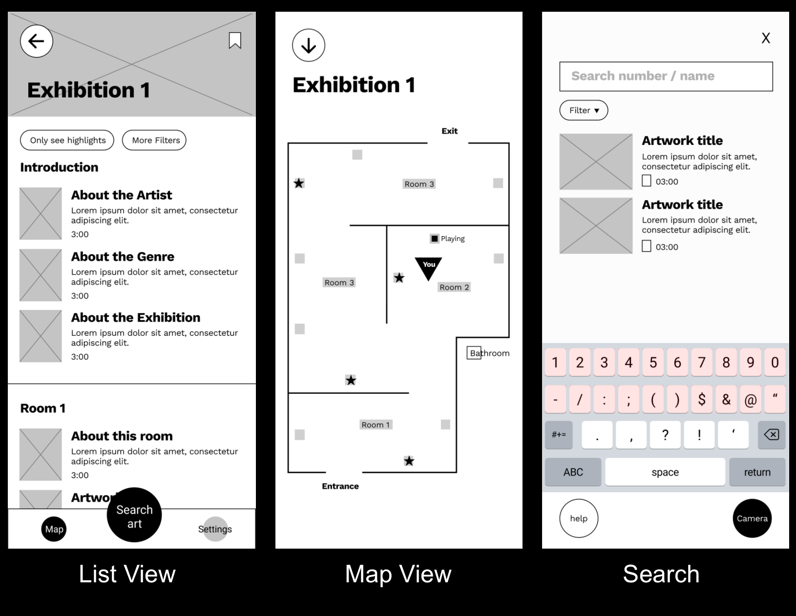
High fidelity prototype
(clickable ⬇️ )
(clickable ⬇️ )
DISCOVER THE PROBLEM
Research Goal:
• What do users want to learn in an exhibition?
• What problems do users have with the audio guide?
• What problems do users have with the audio guide?
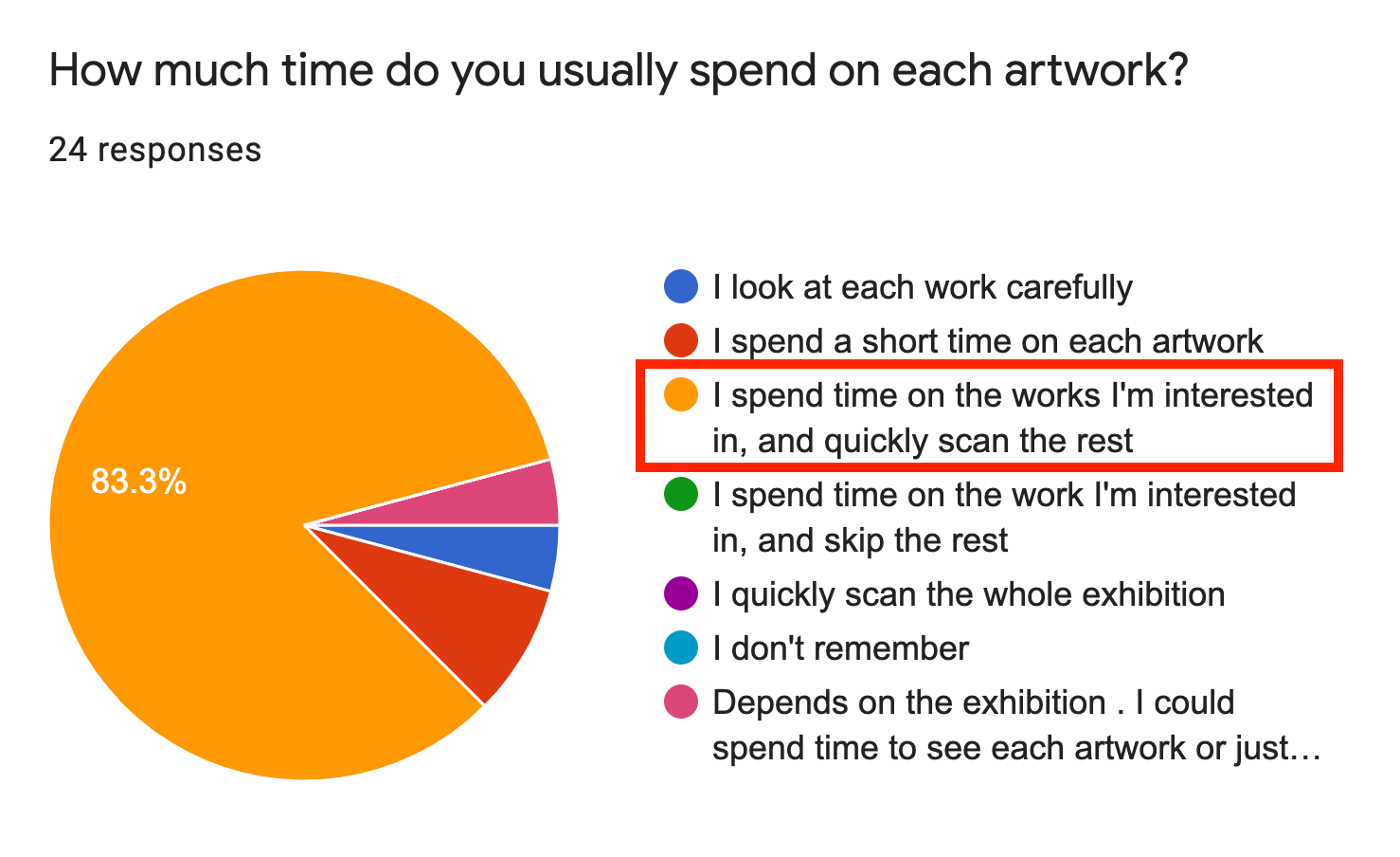
1. Quantitive Research
I wrote a questionnaire of 30 questions and received 27 answers.
I'm surprised to learn that the meaning and background of artwork are only "somewhat important" to most users. (52.2%)
2. Qualitative Research
I conducted 4 In-depth interviews with people with different backgrounds.
What users say:
"I couldn’t find the information I wanted to know."
1. Participants often find the audio is too long and too boring.
"It's too long that I would be zoned-out. It's better to be concise."
"I wish I could hear more from the artist's perspective."
"I wish I could hear more from the artist's perspective."
2. Participants complain about the information of individual artwork is not helpful enough. Some said they need more background knowledge before they learn anything too specific.
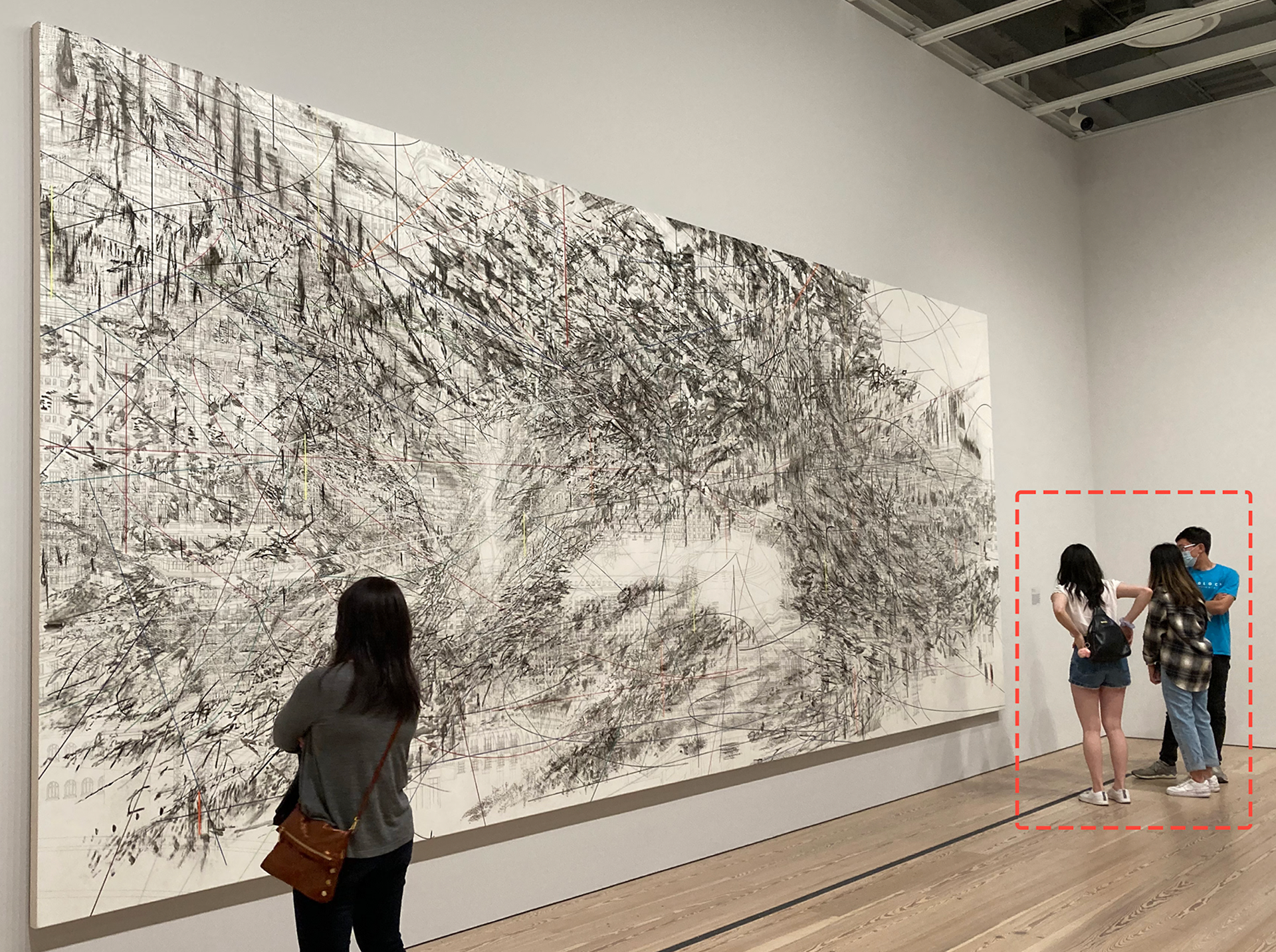
3. On-site Observation
I followed and observed my friend go to an art exhibition and use the audio guide on-site. Being in a real environment helped me tremendously. In the observation,
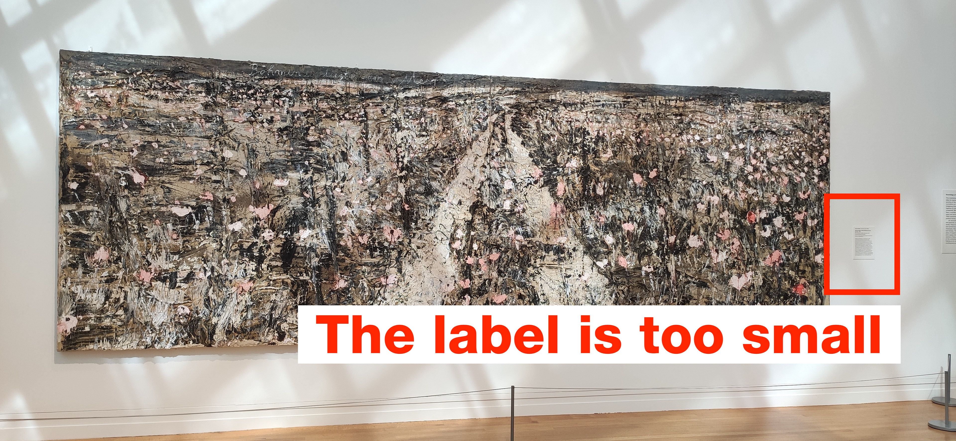
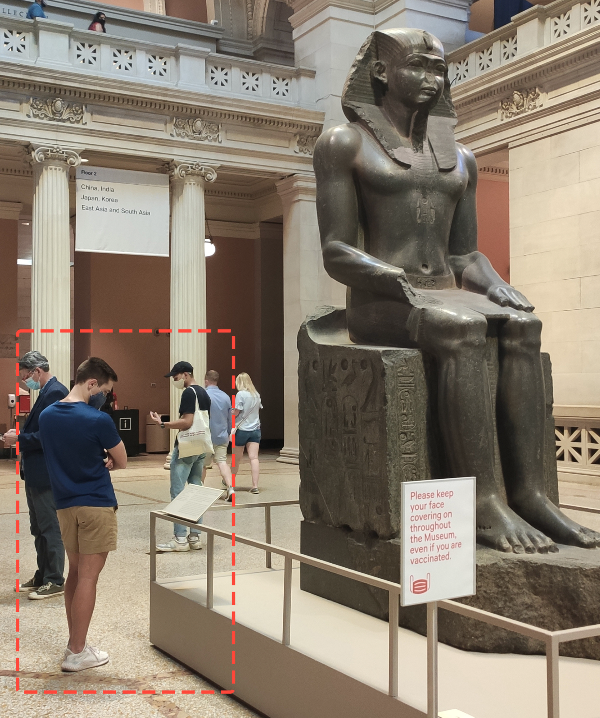
I found wall labels, the most common way to display the information of artworks, have a lot of flaws.
The label is usually very small
1. The label is usually small.
• For popular works, the label is often surrounded by a crowd, which is unfriendly to people who read slow or have low vision.
• Sometimes the label is NOT right next to the artwork, and the user needs to spend time to find it.
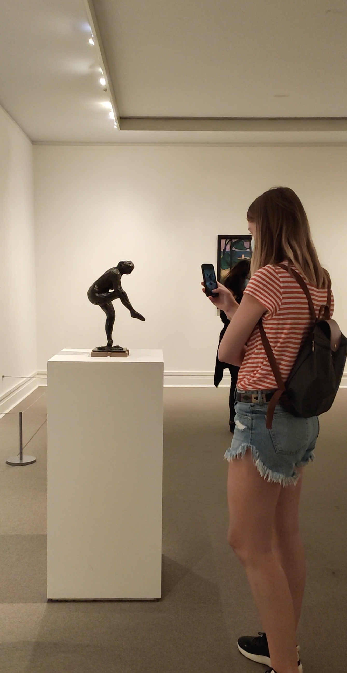
User needs to walk away from the art to read the label
2. Reading label requires many actions.
When users want to learn about an artwork, they need to
• Find the label, walk to the label, read the label, go back to the artwork.
• Find the audio info on the label, enter the audio number, or scan the QR code to listen to the audio,
It takes quite an effort to find the right label for each object
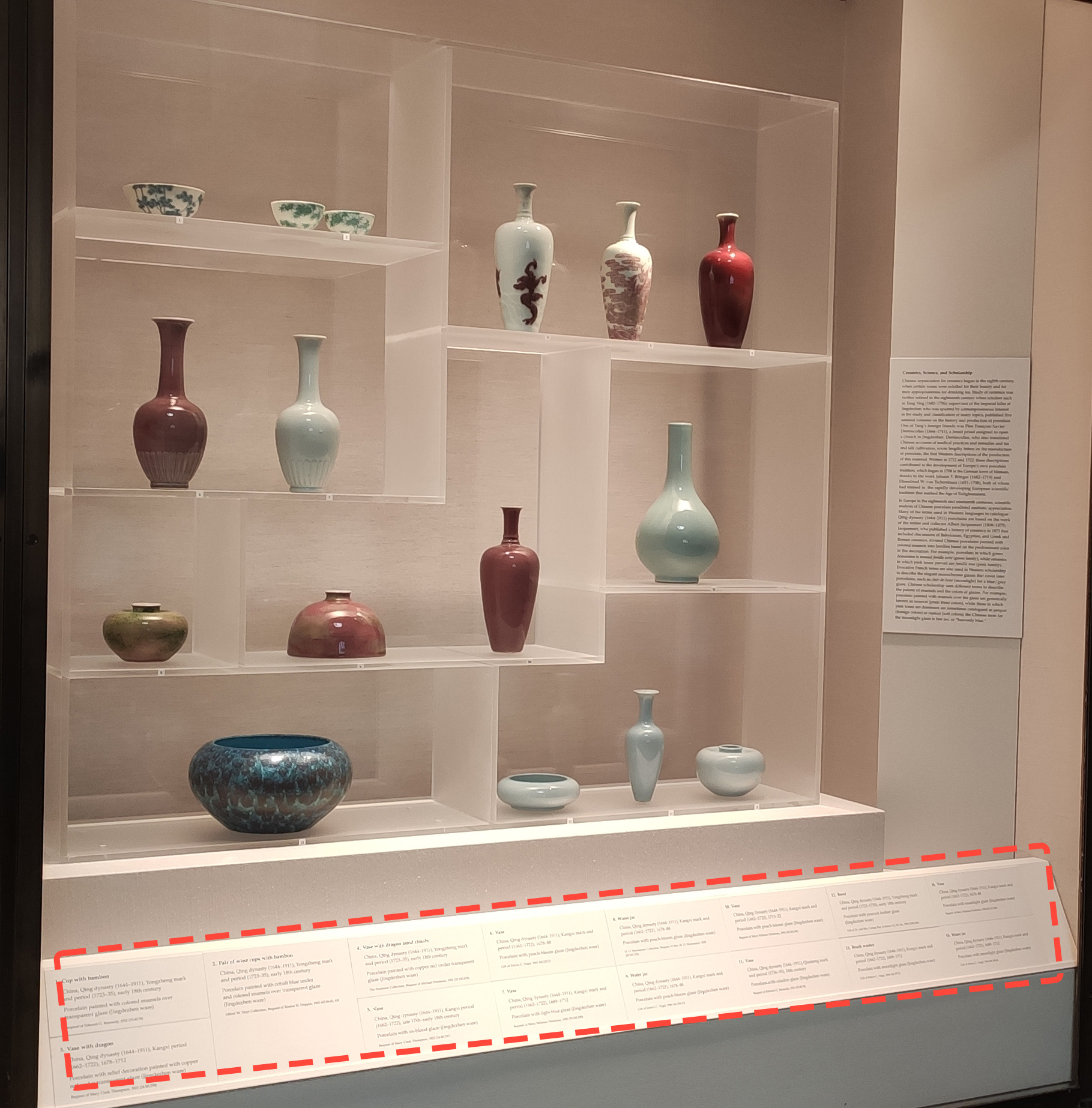
3. When artworks are displayed in a group, the label reading becomes even more difficult.
Sometimes curator would put a group of artworks together on a wall. In this case, the labels become very hard to read.
4. Sometimes the content on the label is different from the audio.
This means users need to read the wall label AND listen to the audio to get the full information of this artwork.
EMPATHIZE
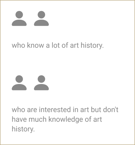
Personas
After all the research, I categorized the users into three types of personas. The photos are generated by AI on generated.photos.
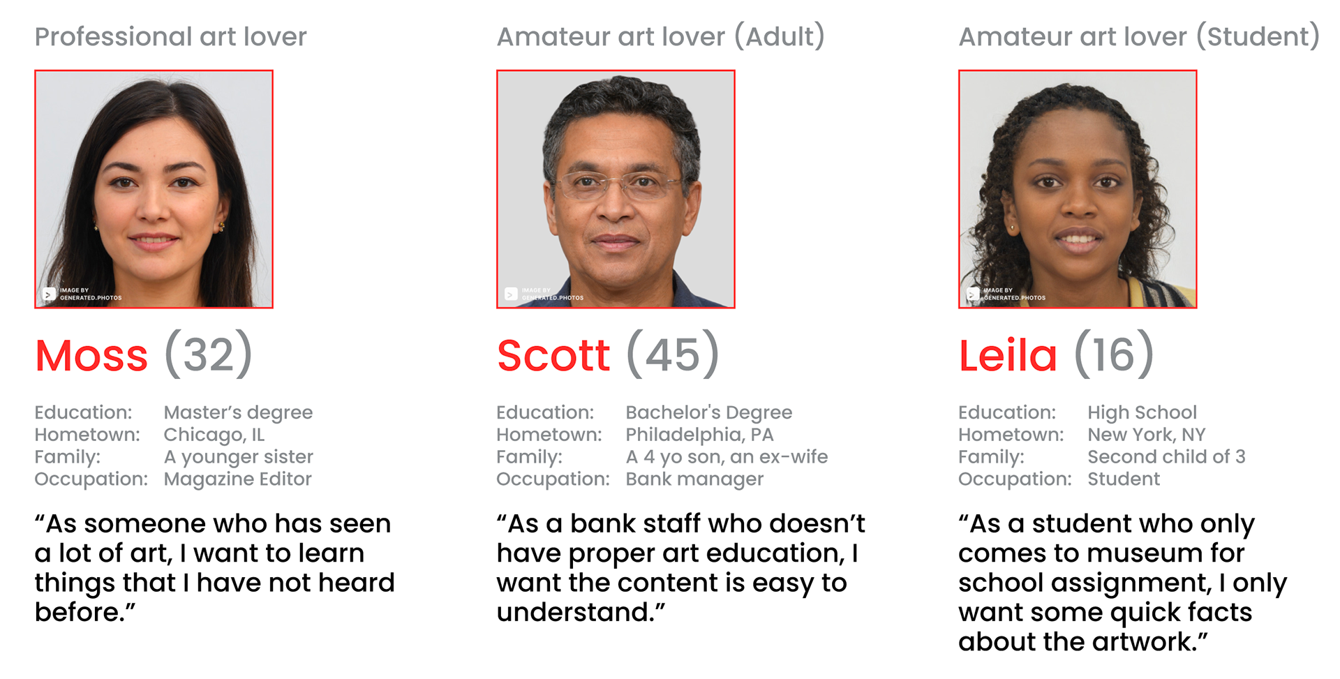
I realized even though most people find the audio not helpful, the reasons behind the complaints are different. Everyone has a different educational background and different interests.
INSIGHTS
Pain Points:
• Users find the audio content too long too boring.
• Users want to learn more background knowledge.
• Users want to learn more background knowledge.
• It's not easy to learn from the small wall label.
Insights:
• The current learning flow in exhibitions (label+audio) is too complicated.
• One type of content is not enough for people from different backgrounds.
* * *
Design Goal:
A museum guide should be informative but not distractive.
Users go to an exhibition to see art, which is their priority. Therefore, the goal is actually to make users spend as little time on the app as possible.
Opportunities:
• How might we diversify the content?
• How might we simplify the learning flow?
• How might we simplify the learning flow?
IDEATE
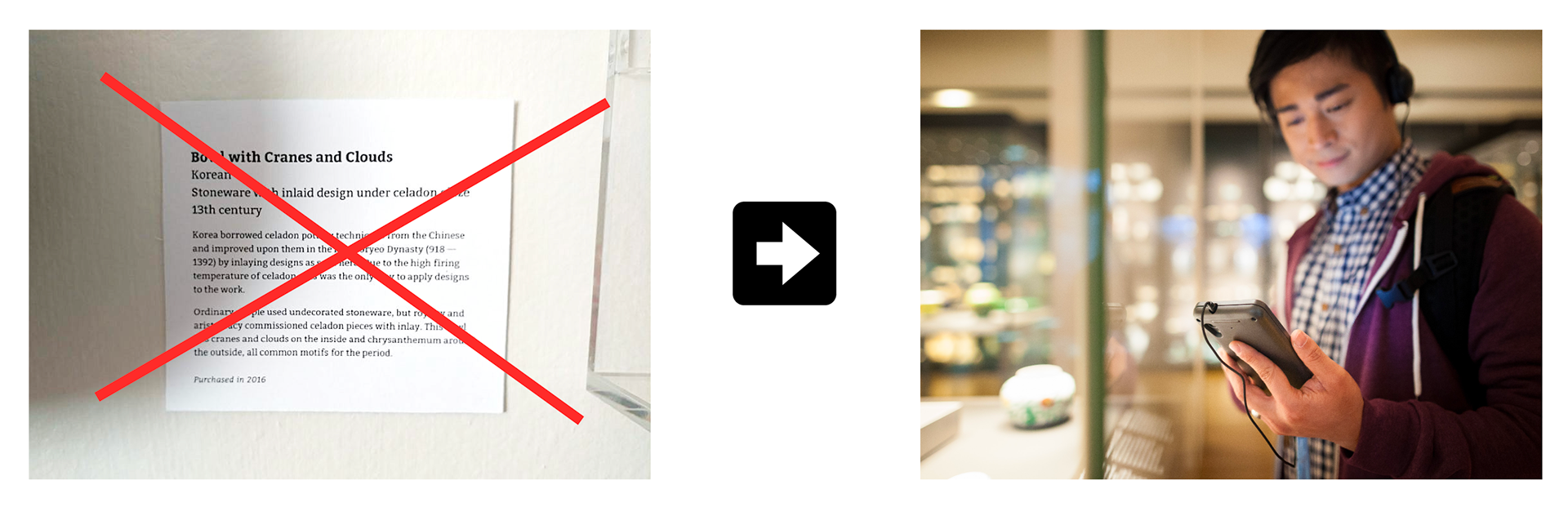
When I was doing the on-site observation, I already decided to skip the traditional wall label and learn everything on the phone.
Instead of having different things scattered all over the place, I want to make this app become a hub of all the resources.
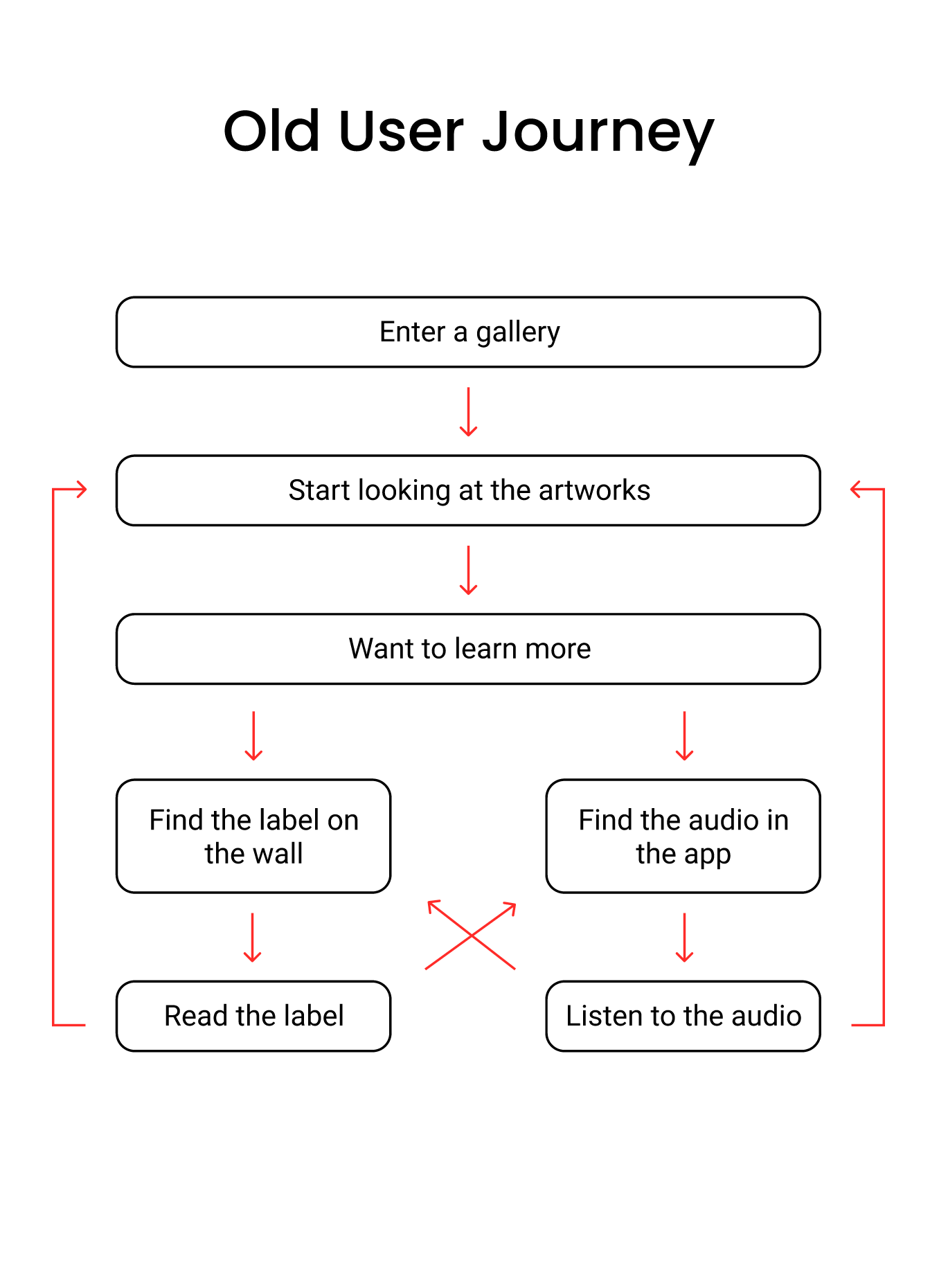
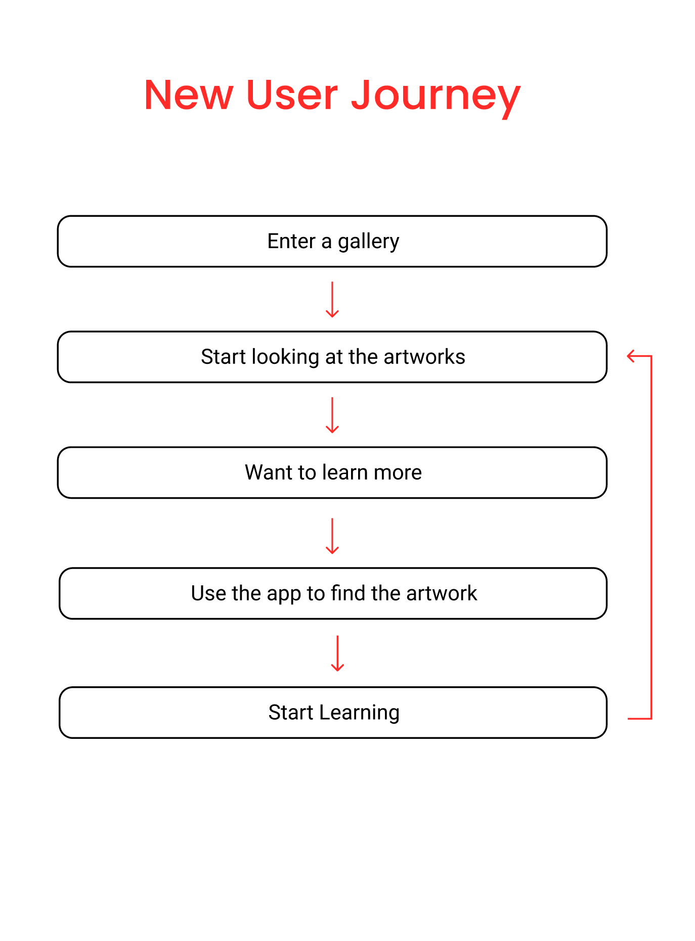
By removing all the actions that are related to the label, the user flow becomes simpler and more linear.
This solution reaches the following design goals:
• Fast: no need to walk around to find the label.
• Easy: no need to enter a number or scan a QR code.
• Complete: no need to jump between label and audio.
* * *
Since I have decided to skip the label, I needed to find out how to identify the artwork just by using the app.
First Idea:
I first thought about using location-aware technology. This means when I pass an artwork, the related info just pops up.
However, there is one problem with this solution: The GPS is not able to know which direction am I looking at, which means the app won't know exactly which painting I want to learn about.
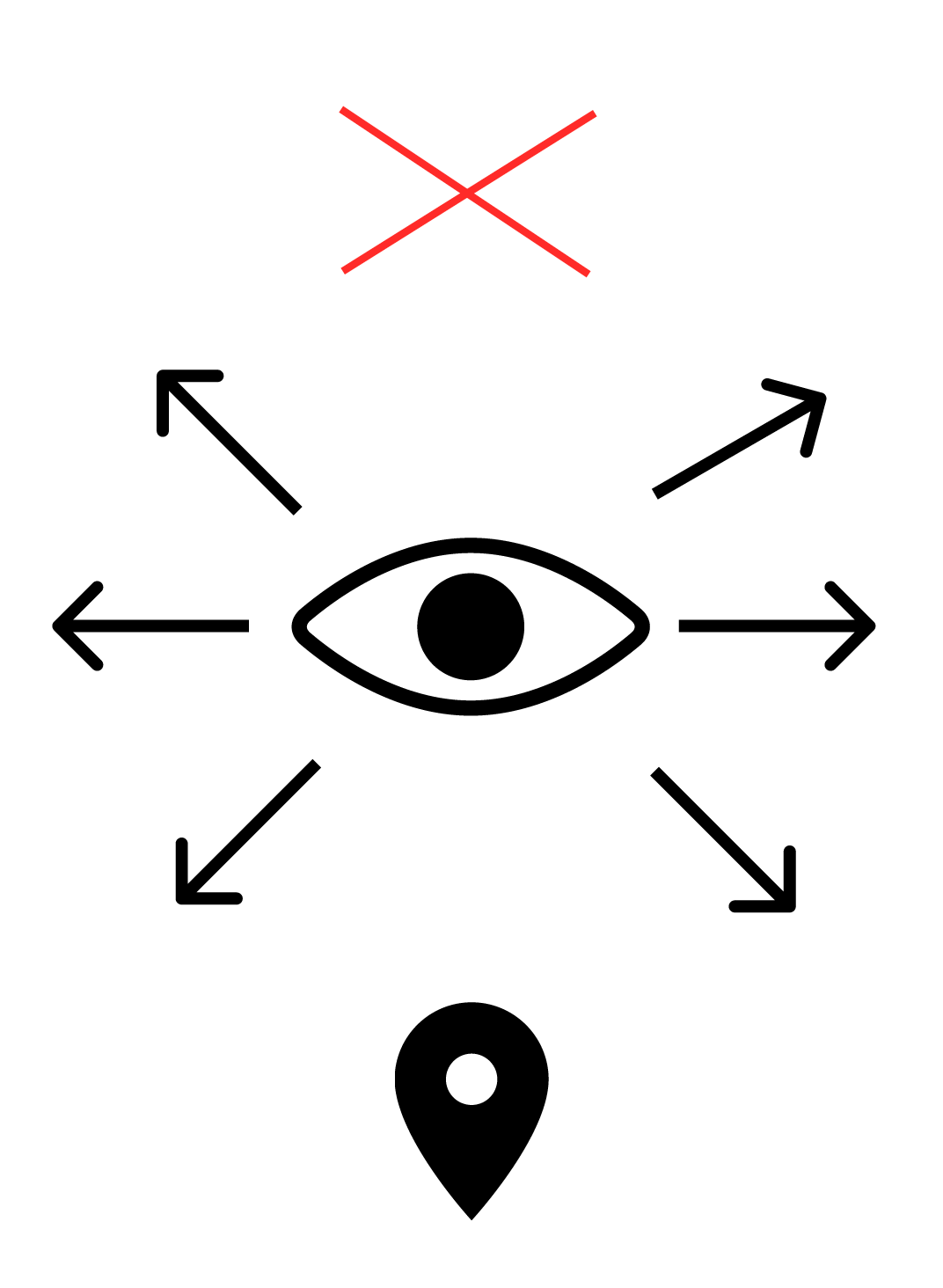
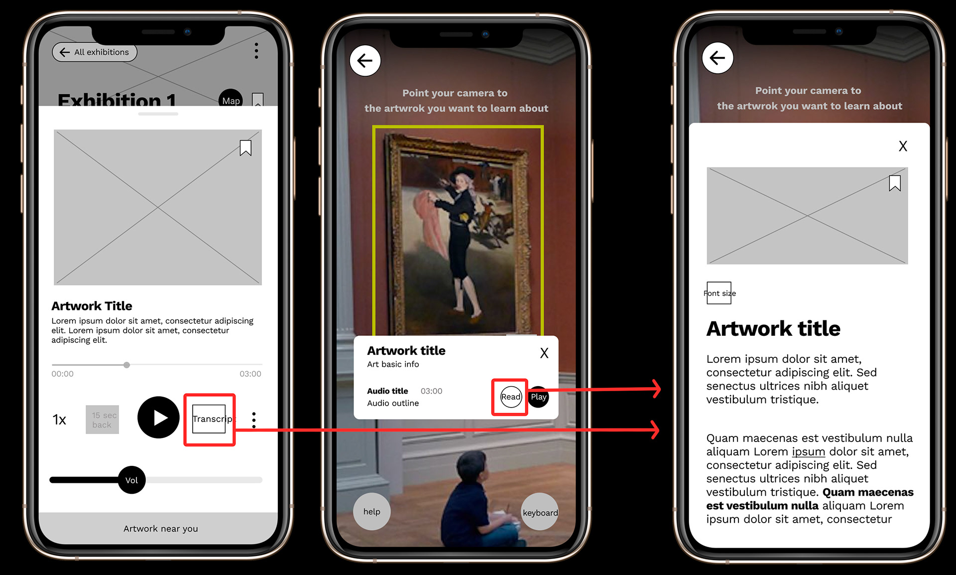
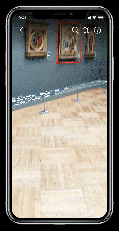
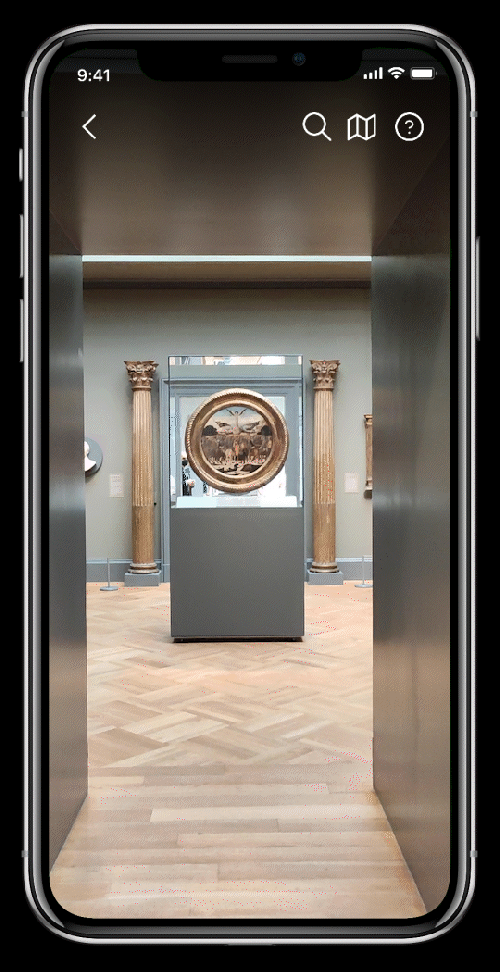
Final Solution: I decided to introduce AR.
Users can simply raise their phones and the app will recognize the artwork.
In the beginning, I wasn’t sure if this is possible. After some research, I found this Guru Experience Company based in San Diego has already built something similar to what I want.
This gave me the confidence to continue with this solution
CHALLENGES
Since AR is still relatively new in reality, I considered several challenging scenarios.
1. When AR is not available:
Either the phone is not a smartphone, or the user is far from the artwork, or the artwork is blocked by a crowd, the user can use the other 3 ways to find the artwork.
2. When audio/phone is not available:
• For those who can't or don't want to use the audio, they can choose to read the transcripts.
• The museum should still keep the wall label, and offer a brochure that include general background info of the exhibition.
• The museum should still keep the wall label, and offer a brochure that include general background info of the exhibition.
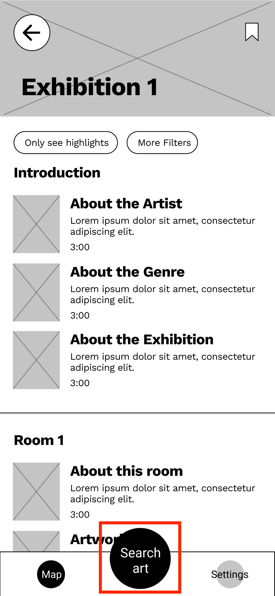
USABILITY TEST
I sent the lo-fi prototype to 5 participants. During the test,
5 out of 5 participants didn’t see the Search Art button immediately.
Participants spent most of the time scrolling the List View. This doesn't reach my goal of making users mainly use the AR camera.
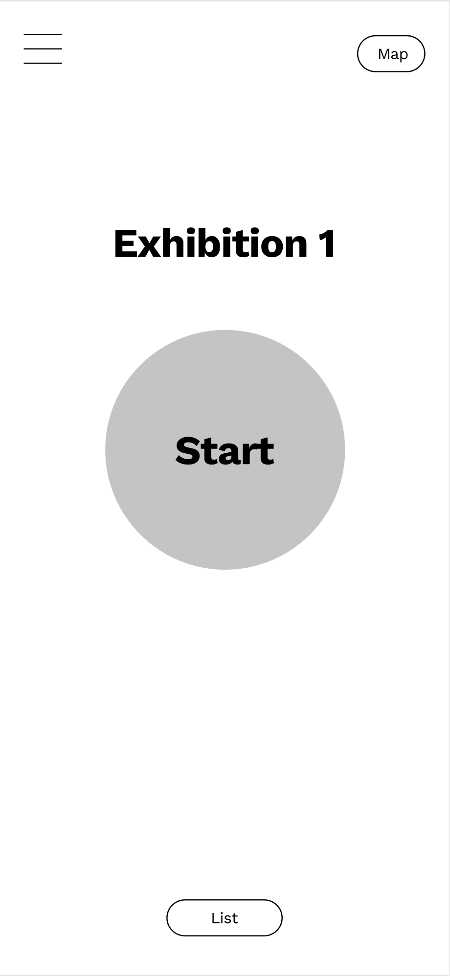
Therefore I made a bold change to make the CTA button much bigger.
Before:
The List View dominated the page
The List View dominated the page
and the Search Art button was easy to miss.
After:
The Start button is the center of attention,
The Start button is the center of attention,
so the interface is clean and direct.
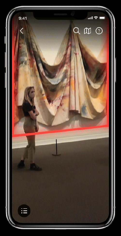
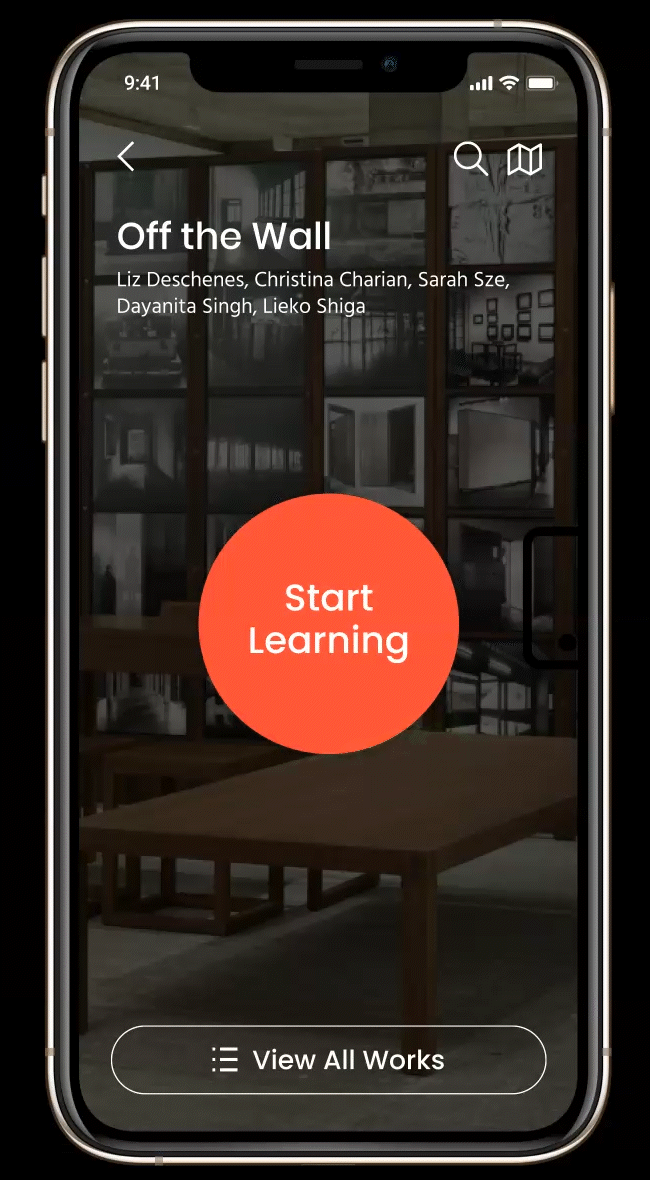
FINAL DESIGN
Learn faster with AR and never miss a thing
The learning experience becomes simpler than ever. You are interested in something, you find all the info immediately.
Learn background knowledge first
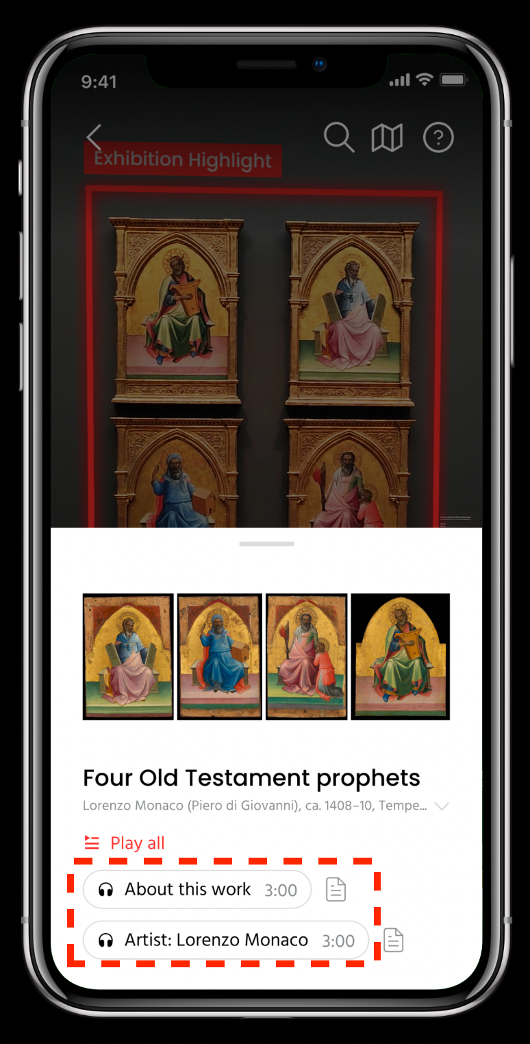
When AR recognizes a user's location, the room info card will pop up. It will lead users to learn more background knowledge about this room before looking at the individual artwork.
Let users know what to expect before clicking
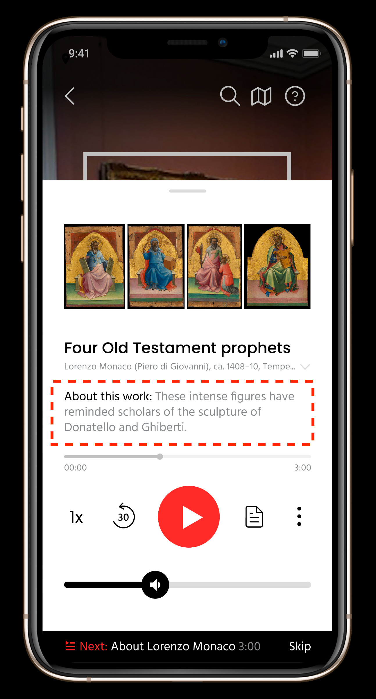
To save users' time and help users find the right information faster, I gave each audio a descriptive title including the duration, and a short outline to help users decide if they want to finish the audio.
ACCESSIBILITY
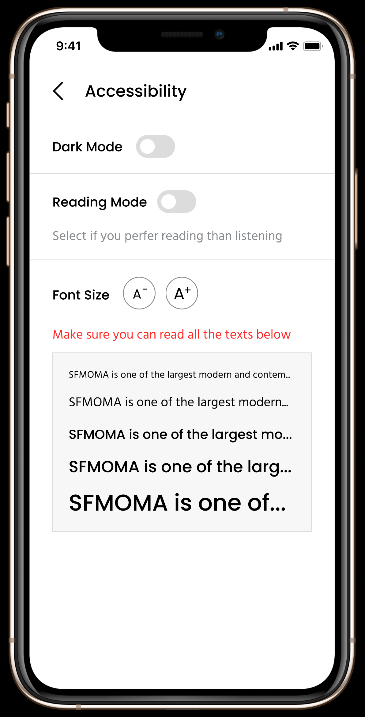
1. Dark Mode and Font Size for users who have low vision.
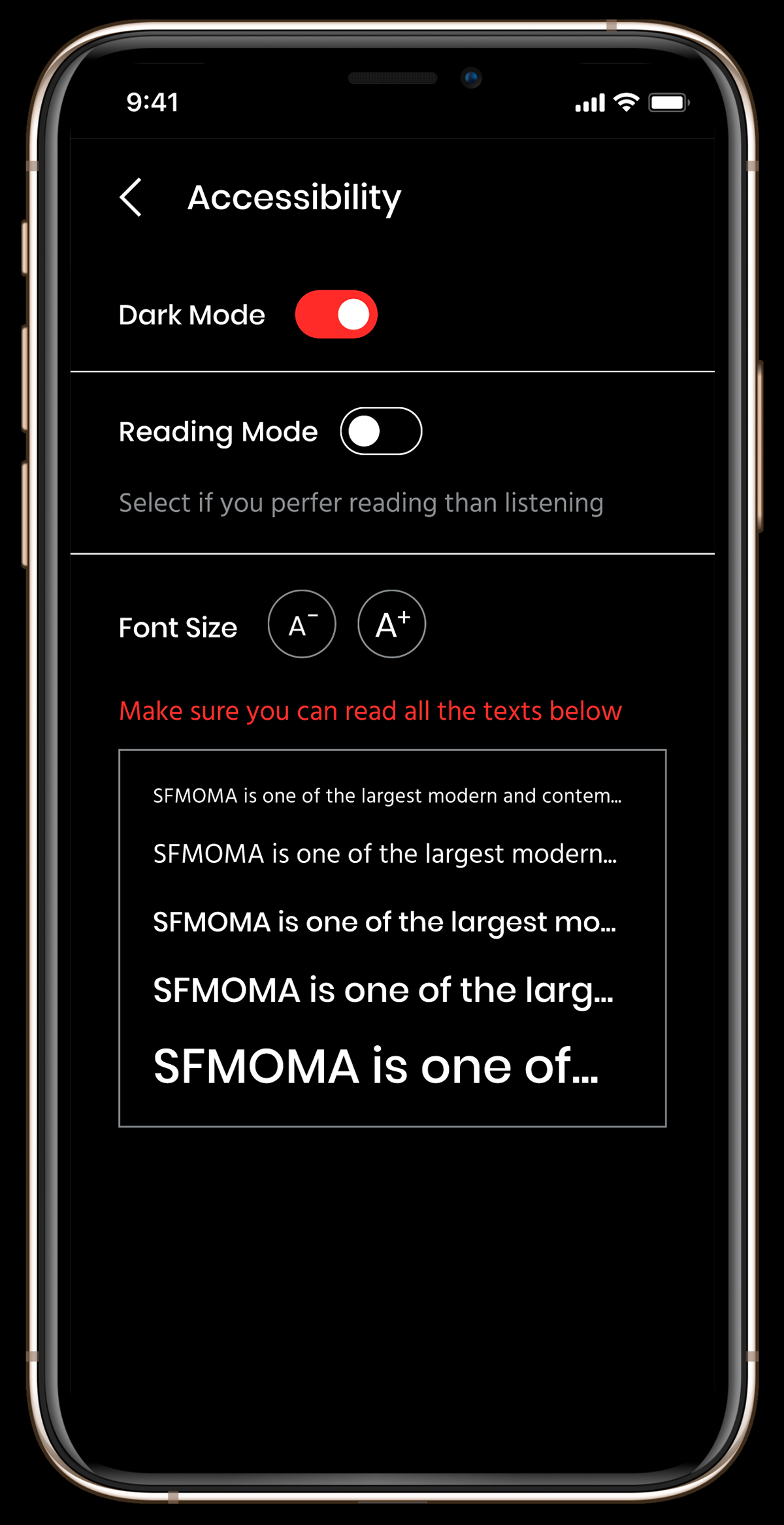
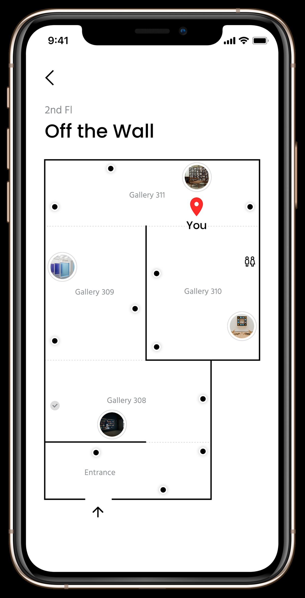
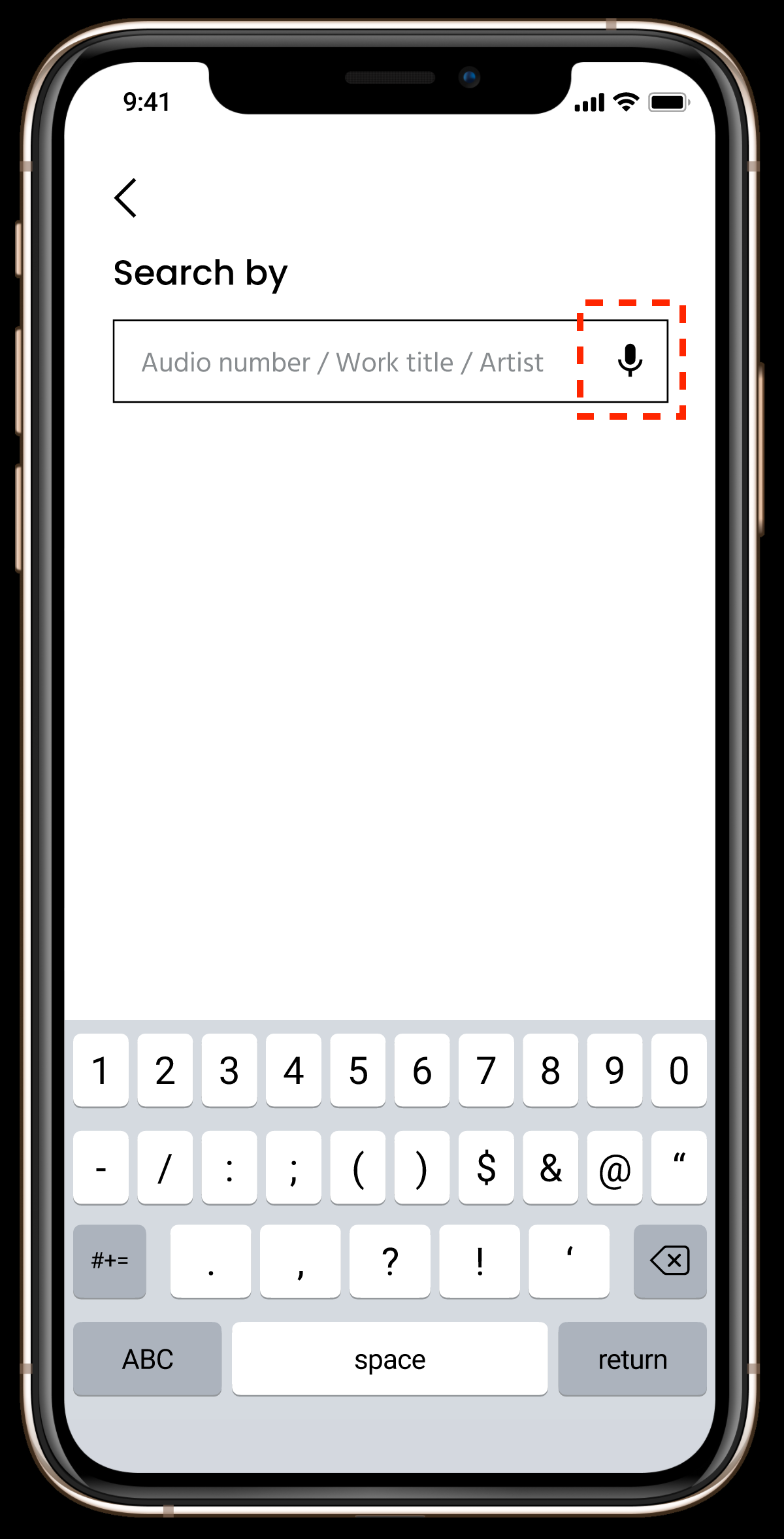
2. List View, Map View, and Search page for the phones that don't support AR. On the Search page, users can use the audio input if they can't or don't want to type.
CONCLUSION
How would this app benefit the museum:
• Time-saving: No need to generate QR code/audio code.
• Offer more with less cost: No need to worry about printing the new content and where to hang them in the gallery.
• Easy management: Edit and update the content digitally in one place.
• Attract attention: The cutting-edge technology would attract a large number of new visitors.
• Lead to a high returning rate: The easy learning method would help users to have a more fulfilled experience in exhibitions, which leads to a sticky ongoing relationship.
What I learned:
Don't be afraid of designing something that has never been seen before.
I'm glad I chose to design a futuristic and innovative product, even though I'm not fully sure about the technical issue of AR that will occur in real life. But after all the research and tests, I believe my solution does solve the problem and this is the right direction.
What would I do differently:
I would love to do more research with the museum side, to learn more about the business needs, the constraints, and their goals.
ACKNOWLEDGEMENTS
This project spanned 3 months include numerous after-work evenings and weekends. I'm incredibly grateful for all the help and encouragement people gave me during this project. I have learned tremendously in the process. I appreciate all the participants who took the time to fill out the questionnaire and spoke with me for the interviews. I also want to thank Will Hsu and Michael Dedrick from Google for reviewing this case study and giving me valuable feedback.
FEEDBACK
Thank you so much for reading this far! Please feel free to send me any feedback! I would really appreciate it!
Thank you so much for your feedback!