

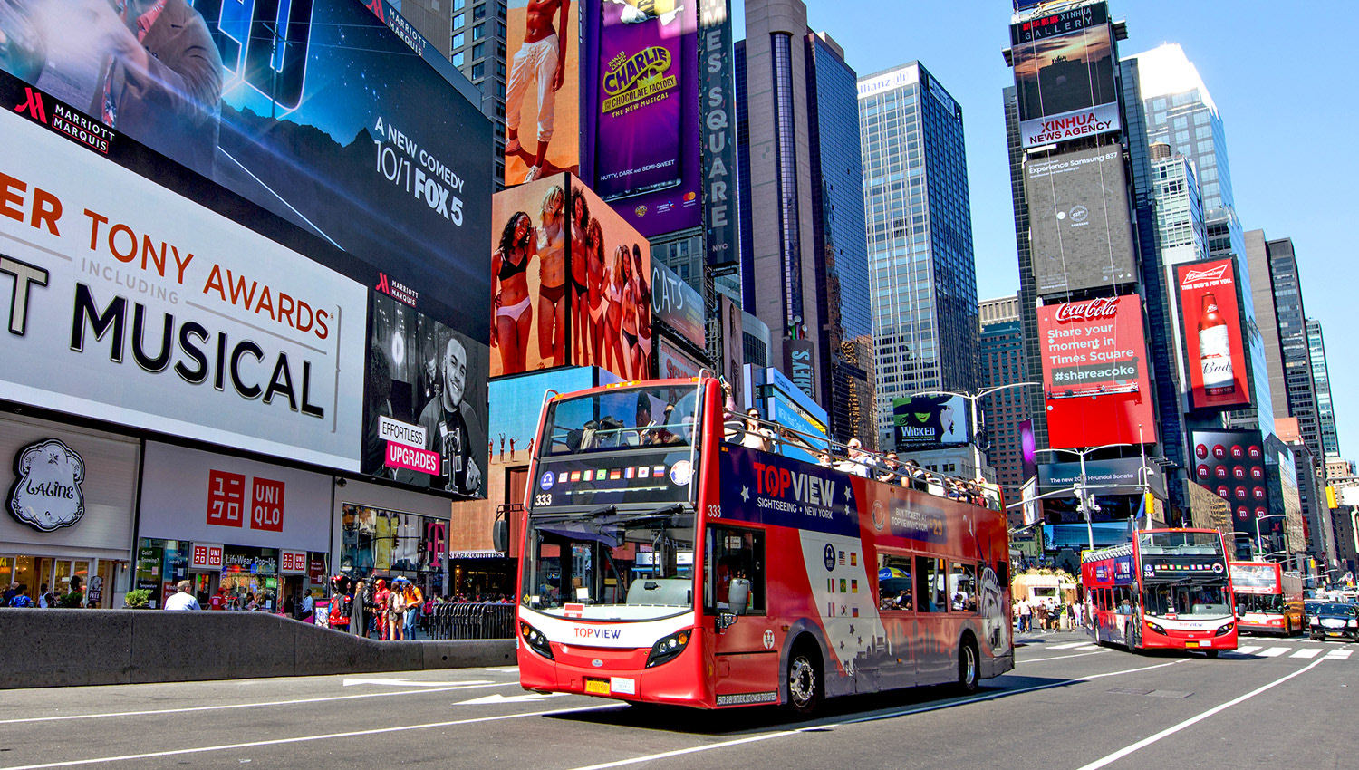
TopView is the leading sightseeing company in New York City who offers tourists experiences such as double-decker buses, cruises, and museums tours .
Team: 1 Designer, 1 Project Manager, 1 Stakeholder, 1 Developer
Time: Feb 2022

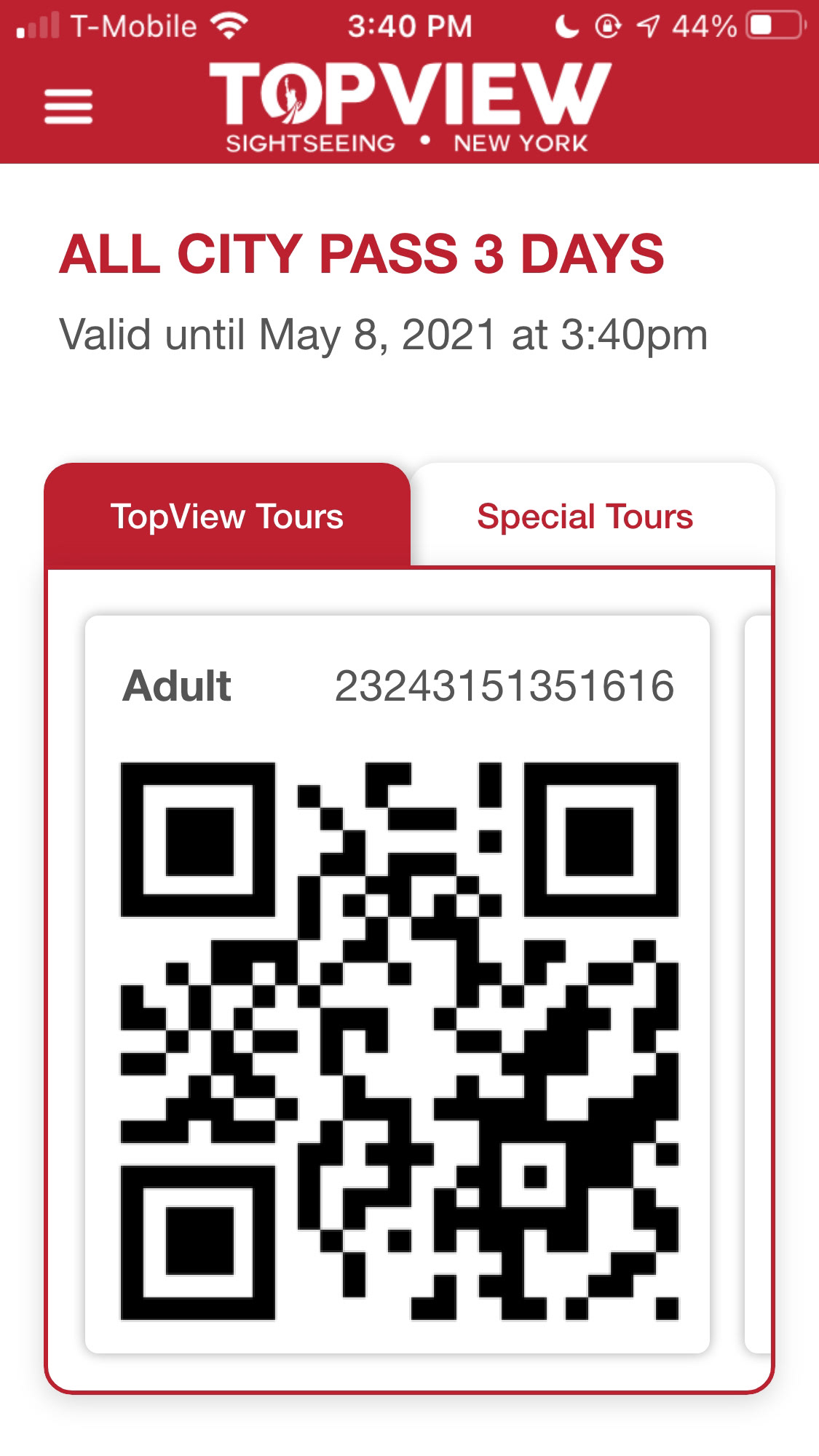
Current version:
All tours = 1 ticket
All tours = 1 ticket
Problem:
Each of our packages contains tours and activities in multiple tourist sites. Users can use one QR code for all experiences. However, a few new organizations we are collaborating with only accept their own QR codes. Therefore, we need to update our user flow.
Challenge: Limited Time
The stakeholders wanted to finish an MVP as soon as possible. This means we need to focus on the most important part of the problem.
Solution:
The best and quickest solution we could think of was to change the architecture to 1 experience = 1 ticket. The solution doesn't change the old user journey and it's pretty straightforward.
⬅️ Clickable prototype
Process
Design goals:
• Minimal design change
Focus on the main problem and make sure the solution can be implemented as soon as possible.
• Keep the same user journey
Don't require customers to do extra or different steps.
• Easy to understand
The new interface should be very straightforward and align with the user’s current habit.
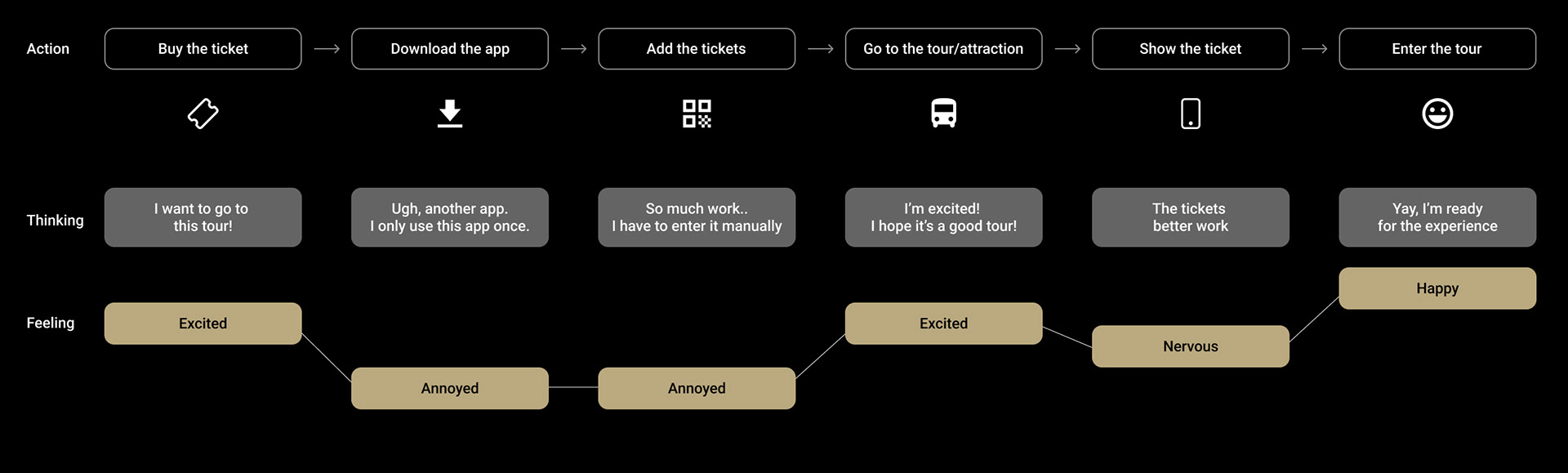
User journey
Explore Ideas
First idea:
We thought about just simply displaying 2 QR codes, and giving a title to each QR code. Something like “our tours” and “special tours”.
But this idea was immediately abandoned because it would cause a lot of confusion to the user.
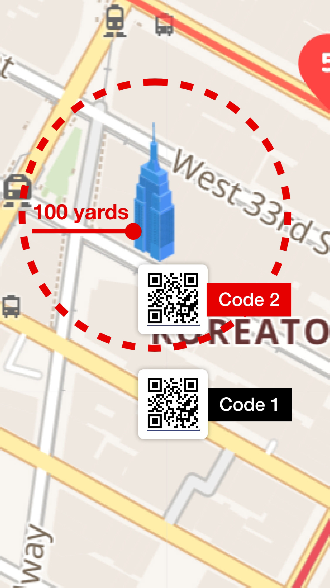
Second idea:
I purposed that since we are already using GPS on our map, it means we can detect customers’ locations. Then when they are near (~100 yards) the attraction that uses the new code, the app will automatically update the code on the back-end.
I thought this was a great idea because it doesn't require any interface change. However the team pointed out that this solution relies on good internet service, but customers who came from another country usually don’t have internet service on their phone.
Final Solution
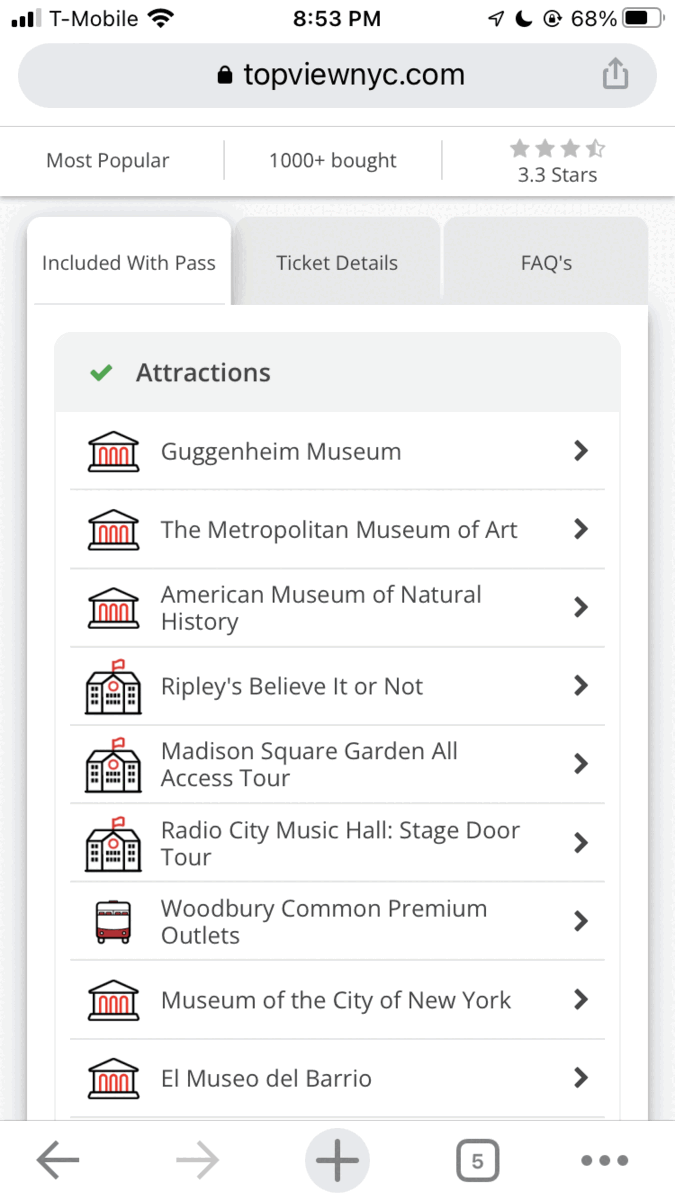
Finally we decided to show the list of tours that are included in the pass, using the same layout as on the website.
Customers will need to select the tour they want to go and then the QR code will show. In this way, we changed the architecture from “I have one ticket that can go to all the tours” to “I have all the tickets of the tours”.
The package detail on the website New design
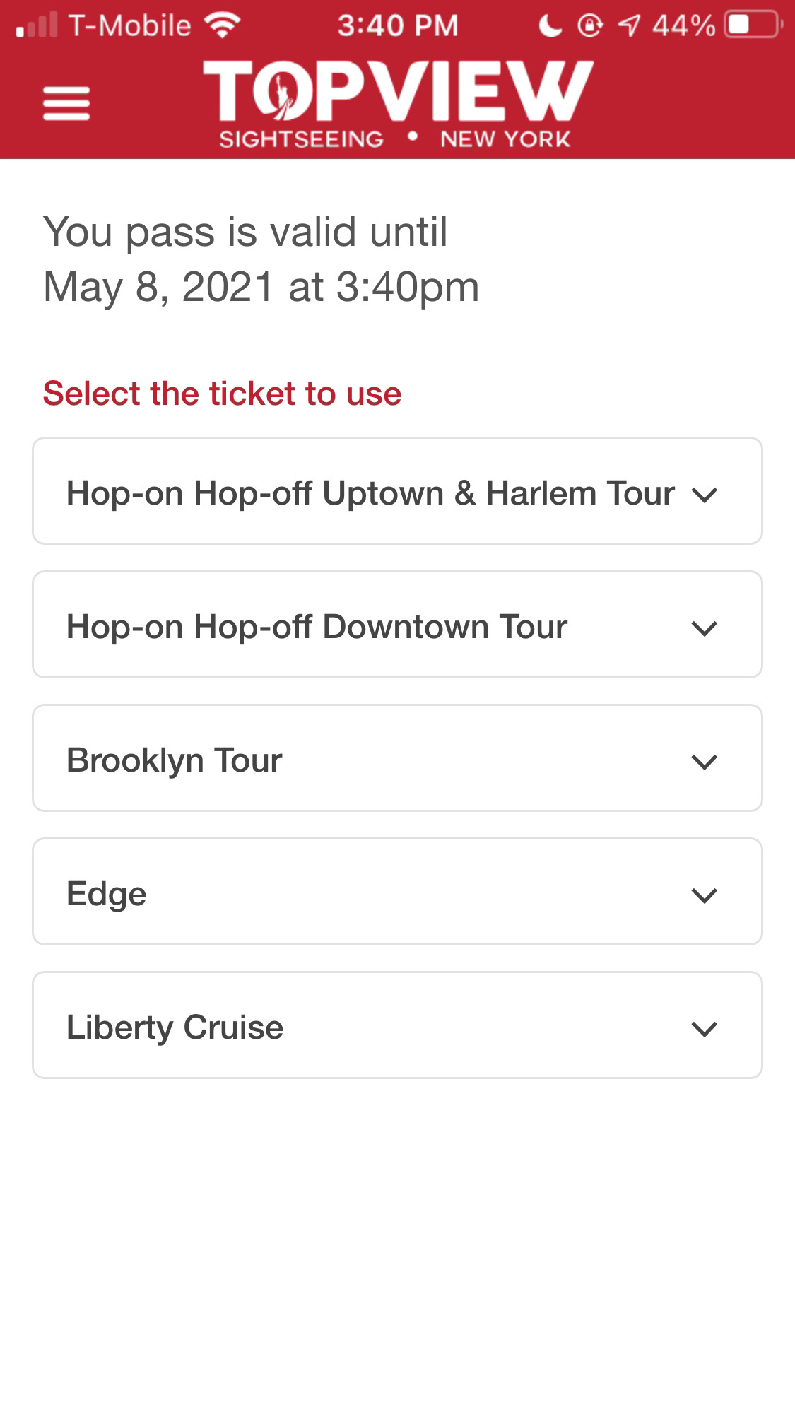
Version 1
How to show the QR code:
❌ Version 1:
• The first version was to show the QR code in the dropdown menu. However, I found this design somehow created an impression that there are 20+ tickets stacked together, which adds a physiological burden to the customers.
• Furthermore, the team pointed out that there could be 20+ tours, it’s not easy to find the right one by sliding the long list.
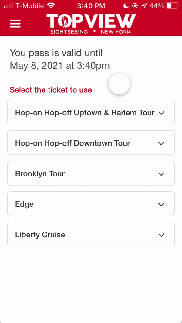
Version 2
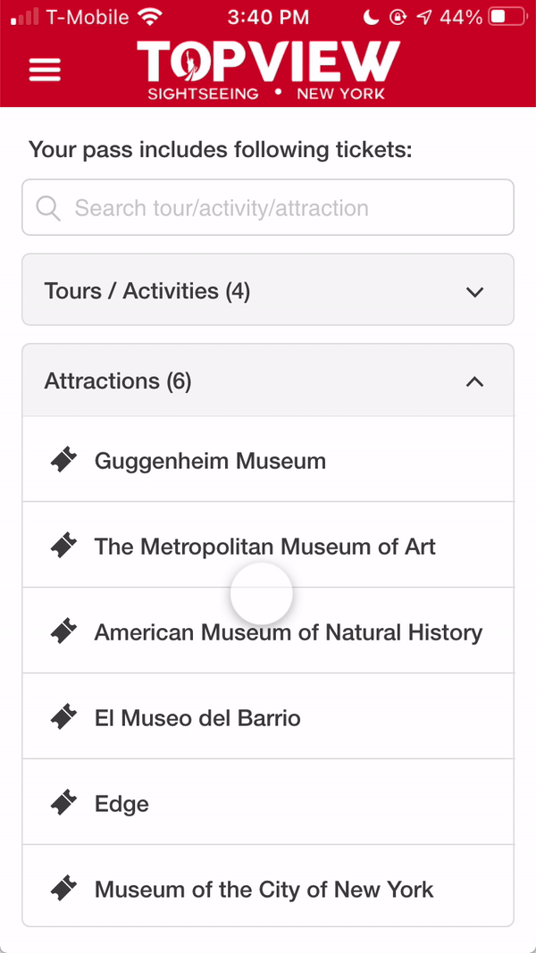
✅ Version 2:
• In this version, I decided to show the QR code in a pop-up window. It’s the same structure but it’s more straightforward and clean.
• In this version, I decided to show the QR code in a pop-up window. It’s the same structure but it’s more straightforward and clean.
• And I split the list into 2 categories, and added a search bar so users can find the tour fast.
How to deal with each tour has different requirements:
Each of our tours has different requirements. Some tours require a reservation while some don’t, some tours are available all day while some can only be used once.
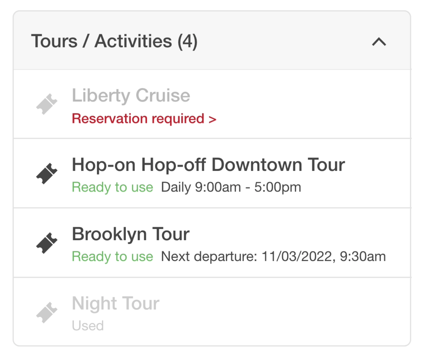
✅ Show ticket status: (Ready to use / Reservation / Used)
We show the status of each ticket to help users prepare ahead before visiting the attraction. We will always put the tours that require reservation first, and the used tickets at the bottom.
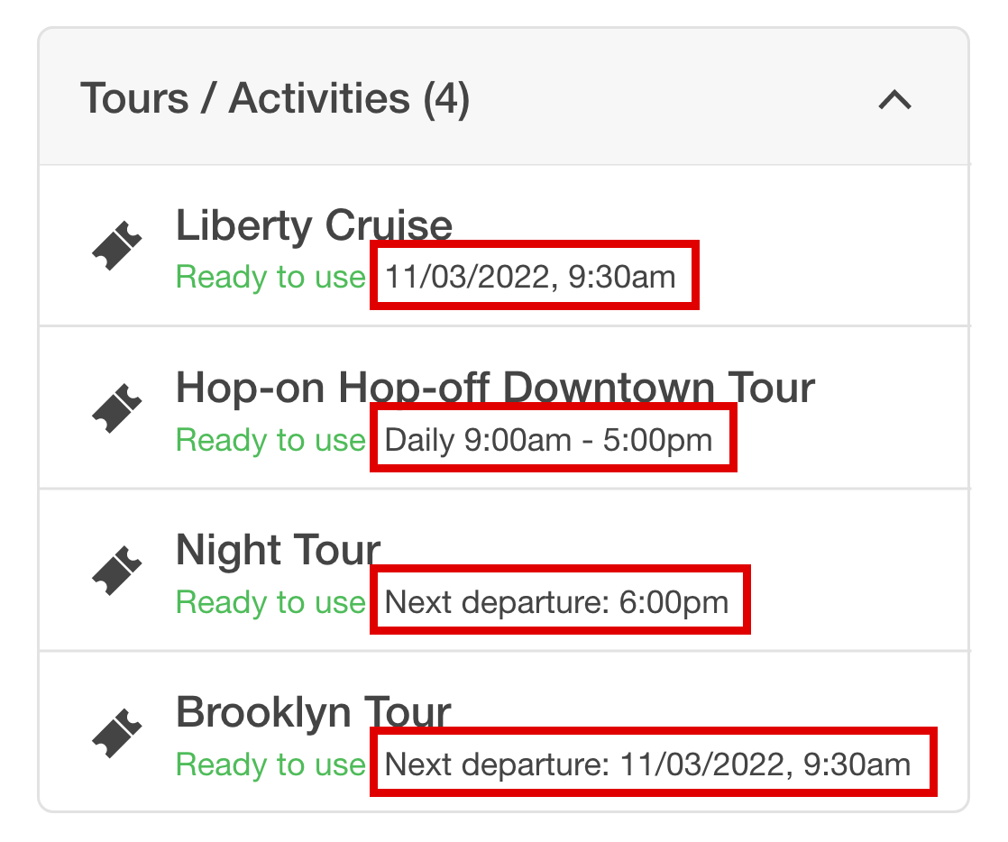
✅ Show the time to visit: (Reservation time / Open hours)
After the reservation, we need to show the time customer reserved as a confirmation. For the tours don't need a reservation, we simply show the open hour of the day, or the next departure time to help users plan the trip.
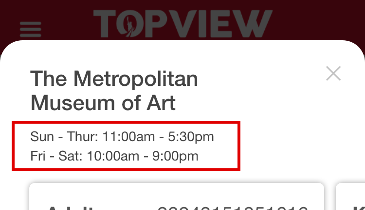
After clicking in, the users will see the detailed open hour of the week.
CONCLUSION
Impact:
This design not only solved the main problem but also brought some extra benefits:
• Increase reservation rate:
Because some tours require a reservation prior to the visit, this design actually reminds the customer to make a reservation, since the tour name will be gray and not clickable.
• Increase ticket usage:
This design shows which tours the customers have visited and which ones they haven’t. The design would encourage the customer to visit more attractions since people usually want to fully use their purchase.
Future Possibility:
This was an urgent operation change and it required a quick and viable solution. Ideally, we still want to keep only one QR code, or come up with another solution that is simpler and easier to use. This MVP solves the most crucial usability problem but there are still a lot to improve.