


Project year: 2021
Event Cruises is one of the brands in the TopView Sightseeing portfolio, where I have been working for 2 years. The company offers a variety of cruise tours in New York City.
Problem: Complicated checkout
Along with the growth, the company implemented more and more features into the website. Inevitably, the checkout flow became too complicated and confusing.
Because there was no designer, all the products were developed by the engineers and other non-designer team members. Therefore, some of the pages became chaotic and not user-friendly.
When the company realized the checkout flow was cluttered and confusing that had affected the conversion rate and the brand image, I was assigned to improve the design.
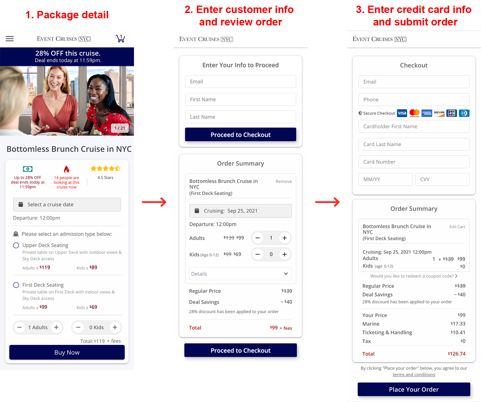
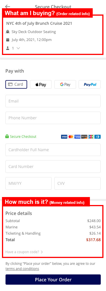
Old Version:
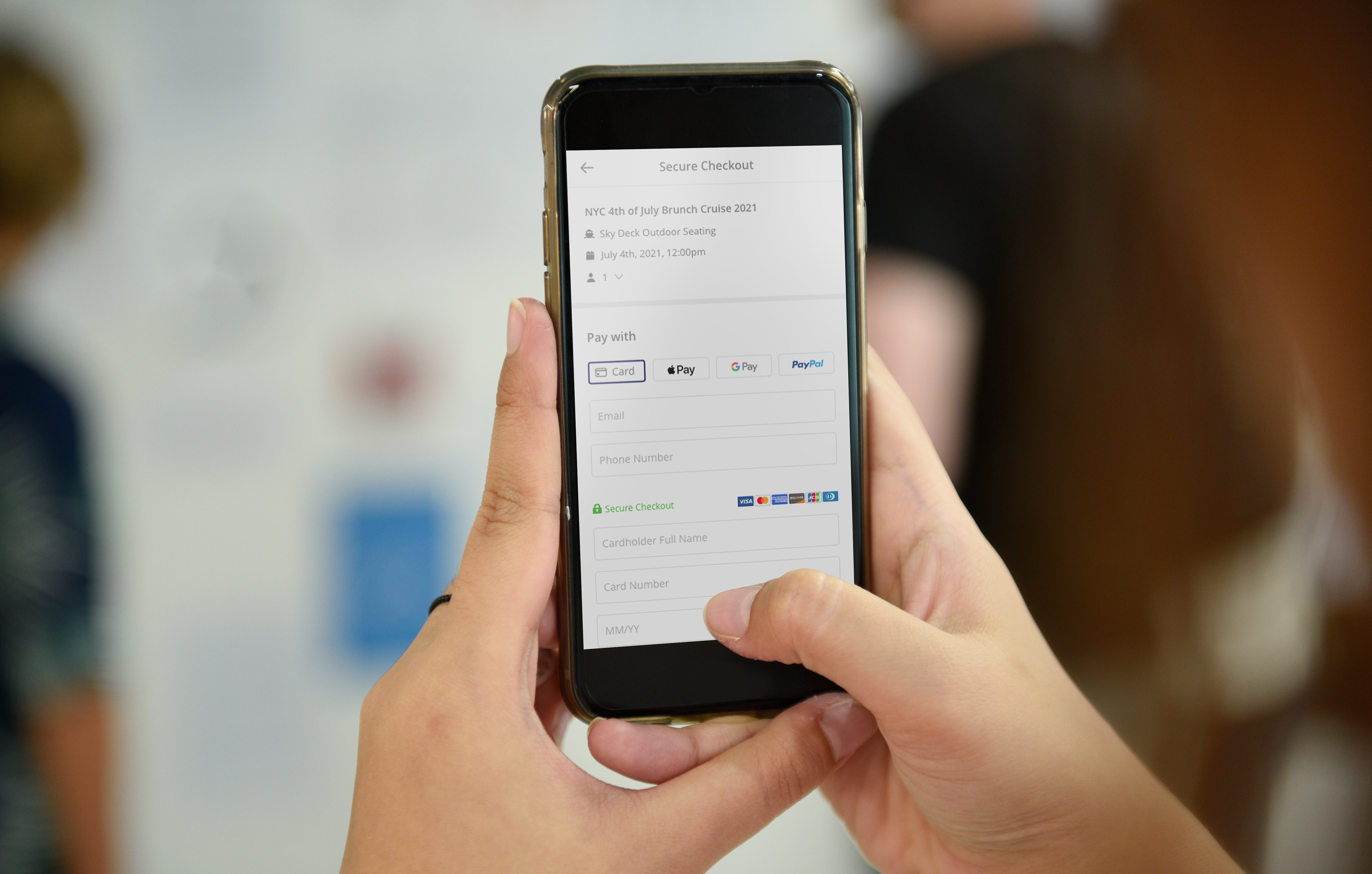
Solution
1. Only show what is most essential.
We merged repetitive information, removed and hid the less important ones.
2. Add more payment methods to speed up the checkout process.
Allow users to use Apple Pay, Google Pay, and PayPal, so the users don't have to enter the credit card info.
3. Clean up the layout to improve the readability.
Increase the contrast of the font size and replace some titles with icons.
High fidelity prototype:
(Clickable ⬇️)
👁🗨 Design Audit
When I was assigned to the task, I instantly inspected a few problems.
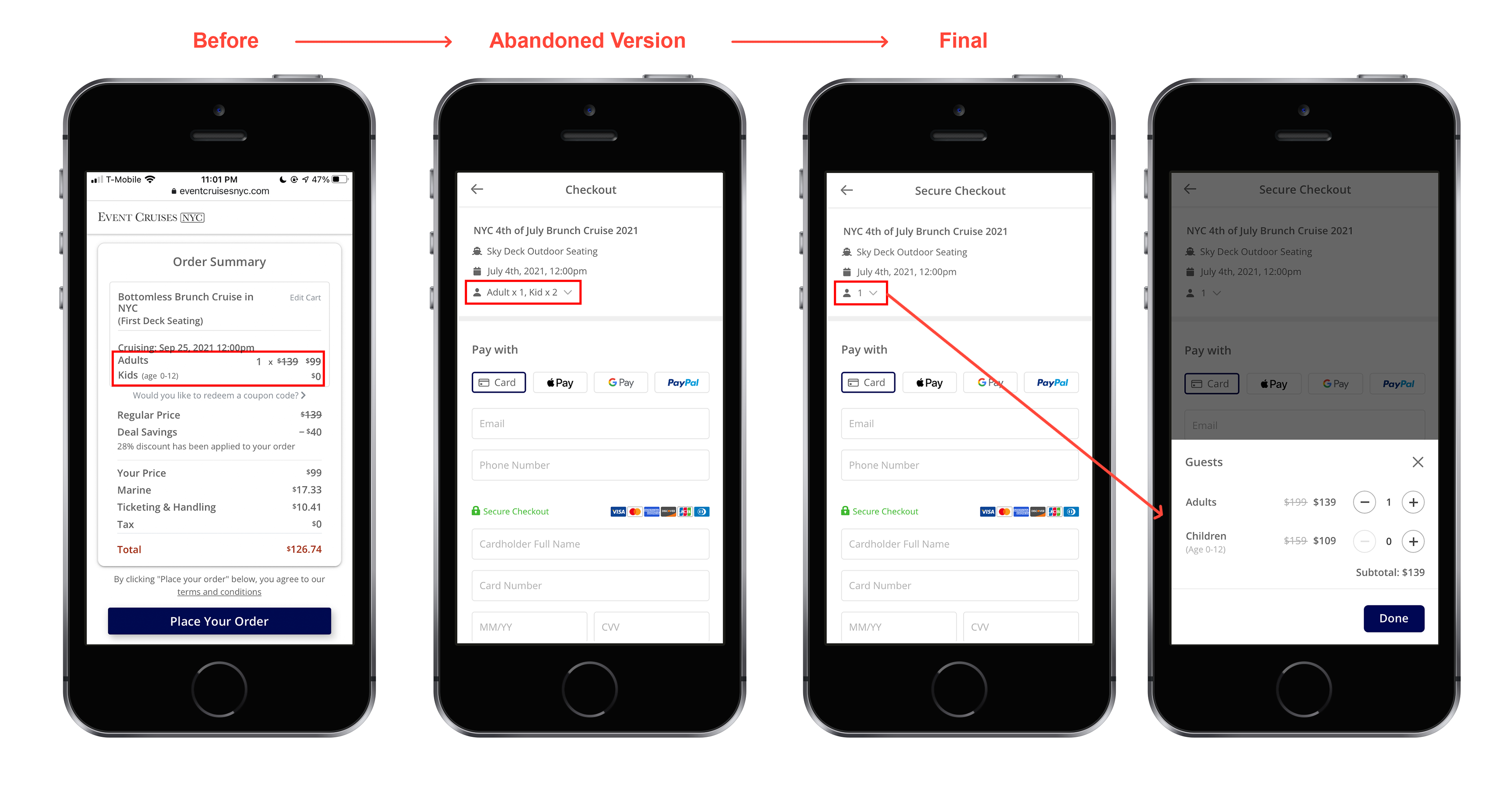
1. The content is repetitive. The “Order Summary” title was repeated 3 times, the email and name are repeated 2 times, and 2 identical CTA buttons on the second page.
2. The layout changes dramatically on each page. Different layouts give customers a feeling that the order info is changed, which forces them to read again. Which caused the checkout time becomes unnecessarily long.
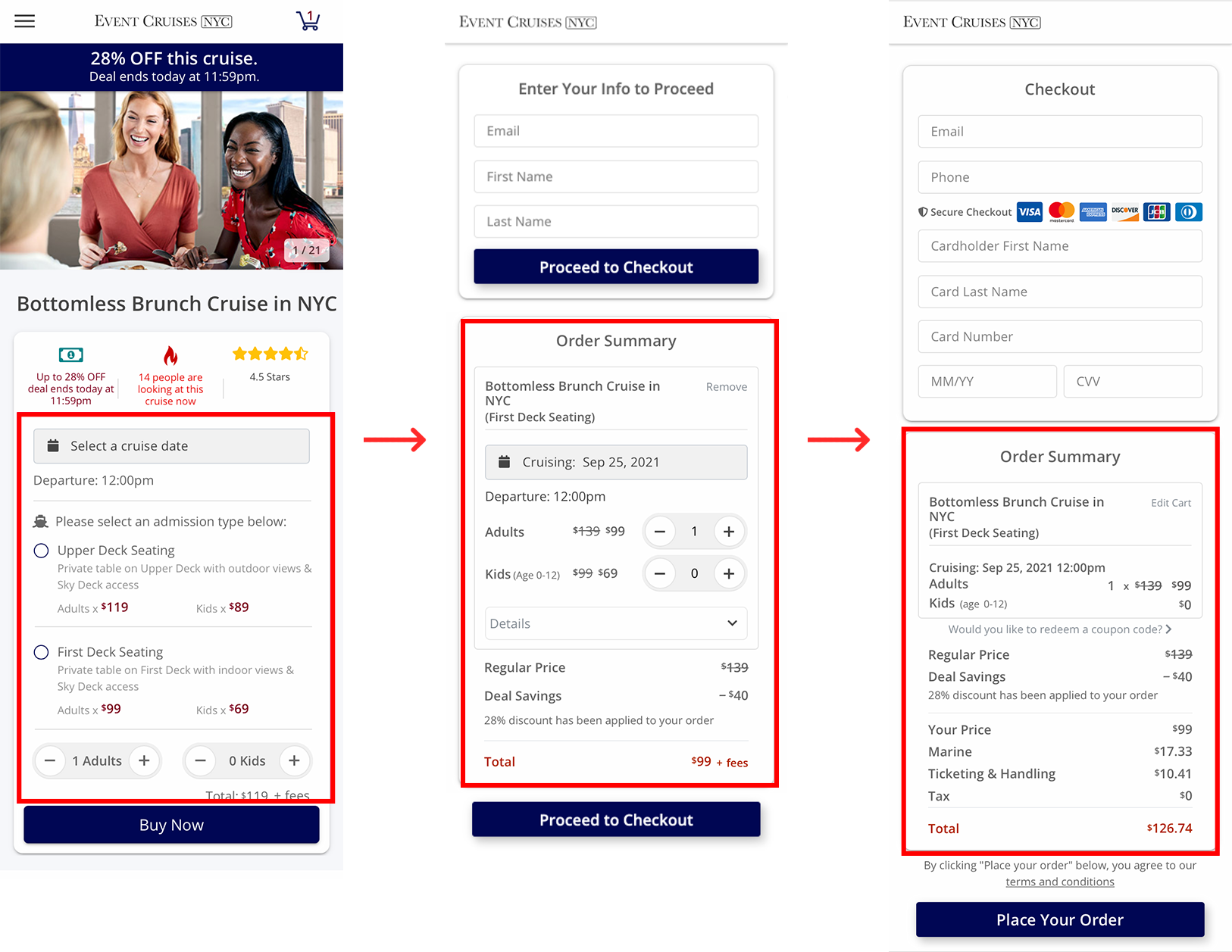
3. Entering credit card info can be a hassle. In the old version, credit card was the only payment method. For customers who don't have the card info saved on the phone or just can't use a credit card for any reason, entering or finding a card can become a burden in the checkout process.
Define
To find the best solution, I need to know what users really want during this process.
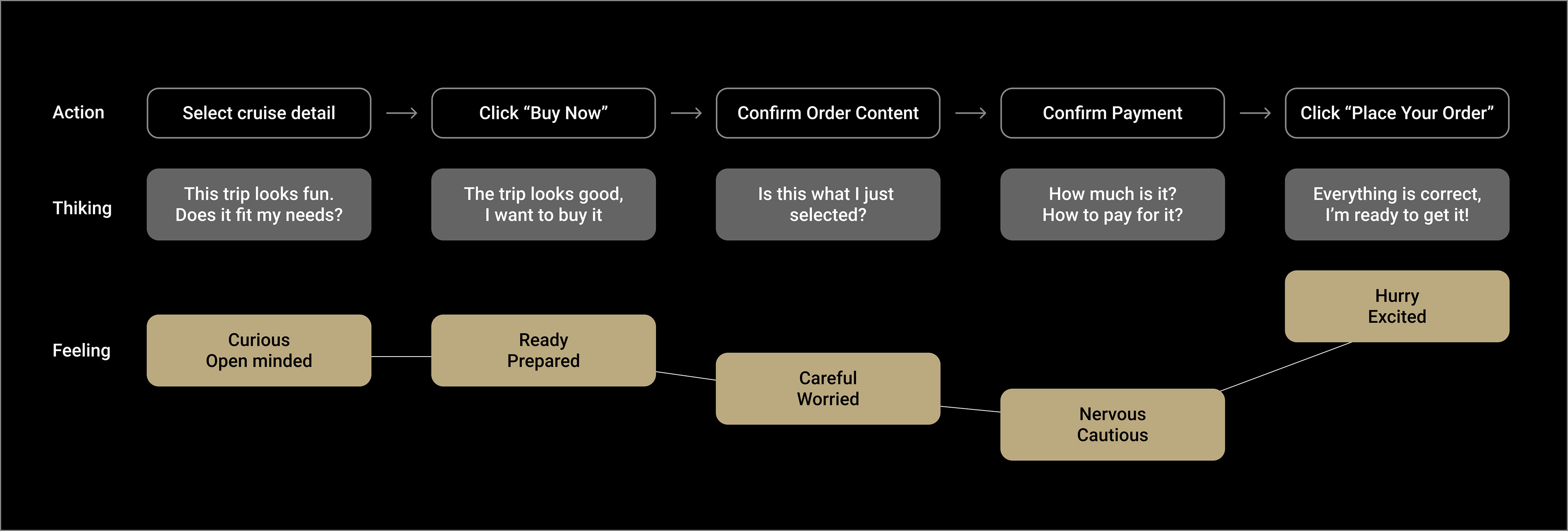
User Journey
Before simplifying the flow, I needed to list out the steps a user must go through in the checkout process.
Problem Statements:
1. During the checkout process, the user needs to confirm the order summary easily, so they don't need to worry about buying the wrong product.
2. As a user who is buying a product with a limited quantity, they need to be able to go through the checkout process fast, so they can get the product before it is sold out.

Design Goals:
Base on the analysis, we decided on the goals of this project. The checkout flow needs to be:
1. Assuring
User needs to feel confident that they are paying for the products they want.
2. Easy and simple
So users won’t lose their seats or get distracted/impatient during the process.
Final Design
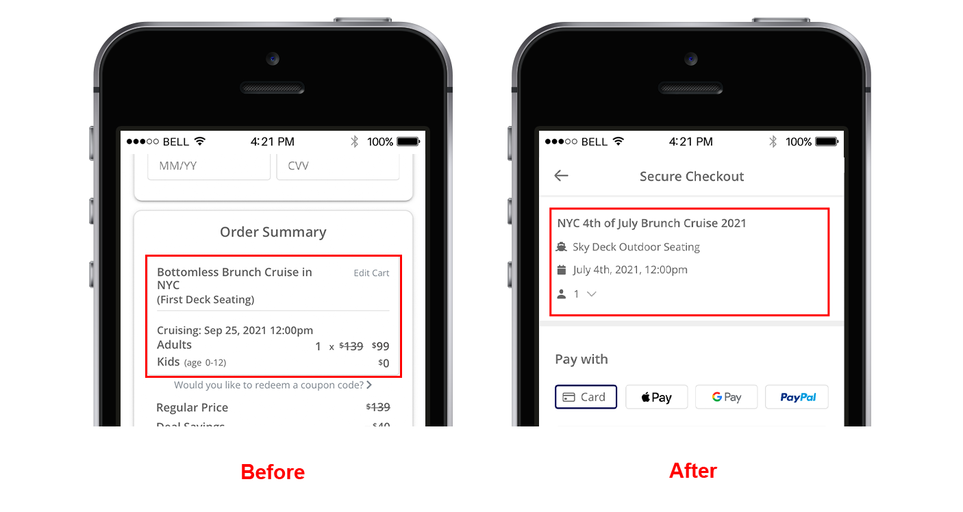
1. Reorganize the order summary to align with the user journey.
We separated the order summary into 2 sections: Order Summary on the top and Price Details at the bottom.
Top: Let users know they are at the right place
By showing the product info on the top, we help users confirm the product is what they want right immediately.
Bottom: Give users the confidence to pay.
By showing the price right above the CTA button, we help users to feel secure when placing the order.
2. Only show essential content based on the research.
After checking with the sales department, we confirmed that:
• 98% of our customers are adults.
• It’s rare for customers to change the total quantity of passengers.
That means, showing the 2 passenger types (Adult and Kid) and the quantity selector was not very essential. Therefore we decided to only show a number of the total quantity of the passenger. When clicking the arrow next to it, a detailed breakdown will pop up and allow the user to change passenger quantity if needed.
Improve the readability
Use icons to keep thing neat. Instead titles like “Date & Time”, we decided to use icons save spaces. Icons also serve as bullet points to make the summary look organized.
Increase the contrast of the text. The old version doesn't have a clear visual hierarchy which make it hard to find key info.
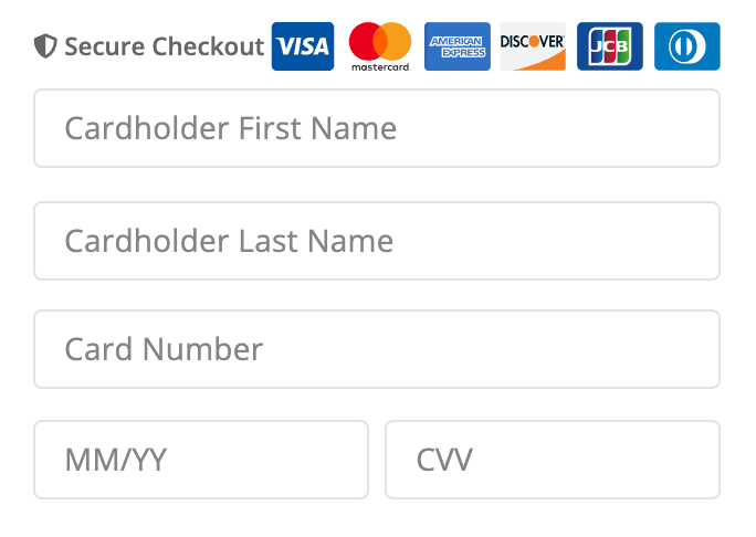
4. Add other payment methods to speed up the process.
Apple Pay, Google Pay, and PayPal allow users to pay the order without entering the credit card info, email, and phone number, which makes the process much easier than before.
Result
The project was still under development when I left the company.
Takeaways
Showing everything is unnecessary and causes frictions. Align the flow with the user journey. We only offer exactly what they need in every step.