
OVERVIEW
About the project
Company: TopView is the leading sightseeing company in New York City. The company offers a variety of tours including double-decker buses, cruises, bike rental.
My Role: UX Designer
Team: 1 Designer (me), 1 CEO, 1 Head of Marketing, 1 Project Manager, 2 Developers
Tools: Adobe XD, Figma, Google Jamboard
Problem:
It was hard for users to manage the trip and fulfill all their needs by jumping between multiple platforms.
The whole process was not only very inconvenient to the users, but also added a lot of workload to the business management.
Solution:
We consolidated all the old solutions into one place (our app) so users can have better control of the trip.
The new version includes everything a user needs to do/know on a trip.
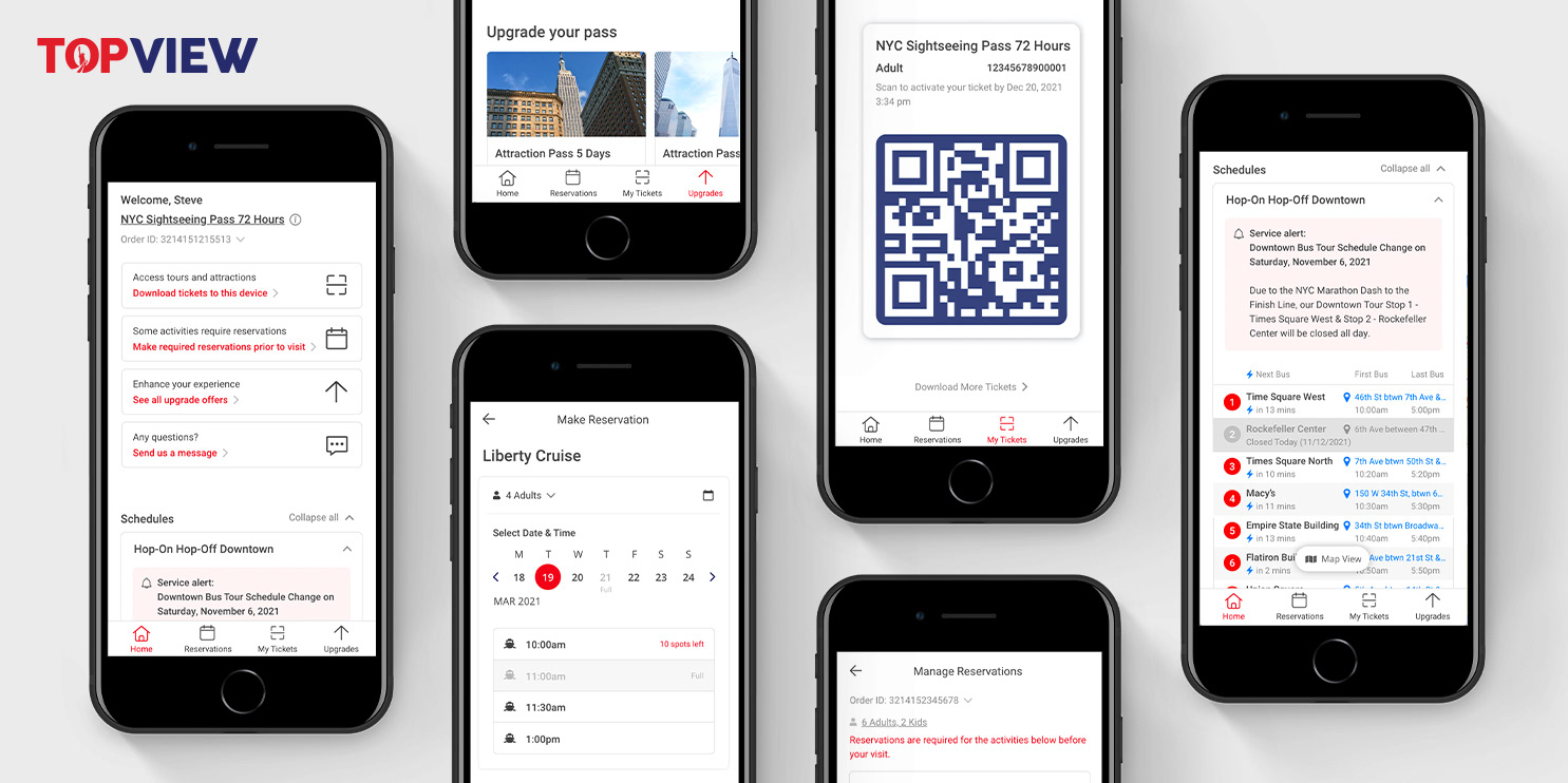
High fidelity prototype:
(Clickable ⬇️)
Impact:
The app is still under development, but we predict that it will tremendously improve the user experience because:
• Better control: Users can easily plan or change the trips the way they want.
• Informative: Users will have quicker access to the important info. Such as locations, schedules, service alerts.
• Time-saving: The new app will save users a lot of time from jumping between platforms and finding info.
* * *
Meanwhile, the company will be benefited because
• The app will release a lot of workload from the customer service.
• The company can easily manage all the flows in one place.
• The company can easily collect all the data for future research.
PROCESS
When I started learning UX, I was intrigued by how UX can solve problems in a systematical way. However, when I tried to apply the knowledge to real work, the process was not as linear as I thought.
What I expected:
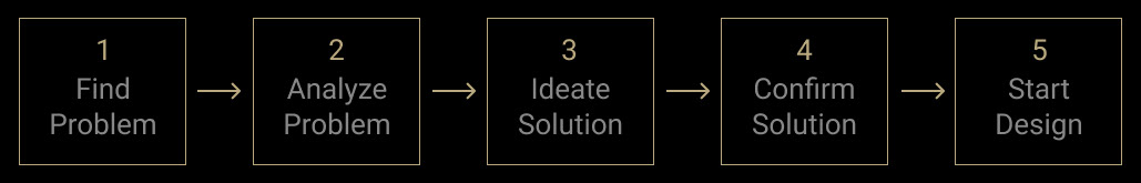
What my boss expected:
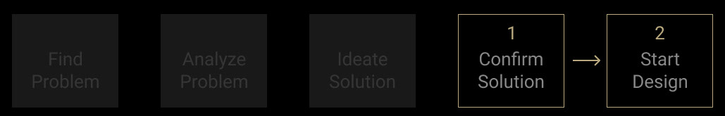
HOW IT STARTED
1️⃣ I was asked to redesign the reservation page, so users can make and change reservations.
2️⃣ As I was working, I was asked to add a feature that allows the user to upgrade the trip.
3️⃣ As I was working (confusingly), I was asked to add the locations and schedules of the tours somewhere on the page.
4️⃣ Before the stakeholders come up with another idea, I said:
“Hold on for a second...what am I designing? What is the problem?”
HOW IT *REALLY* STARTED

To help me understand the project better, the stakeholders told me about the series of feedback we received from customers.
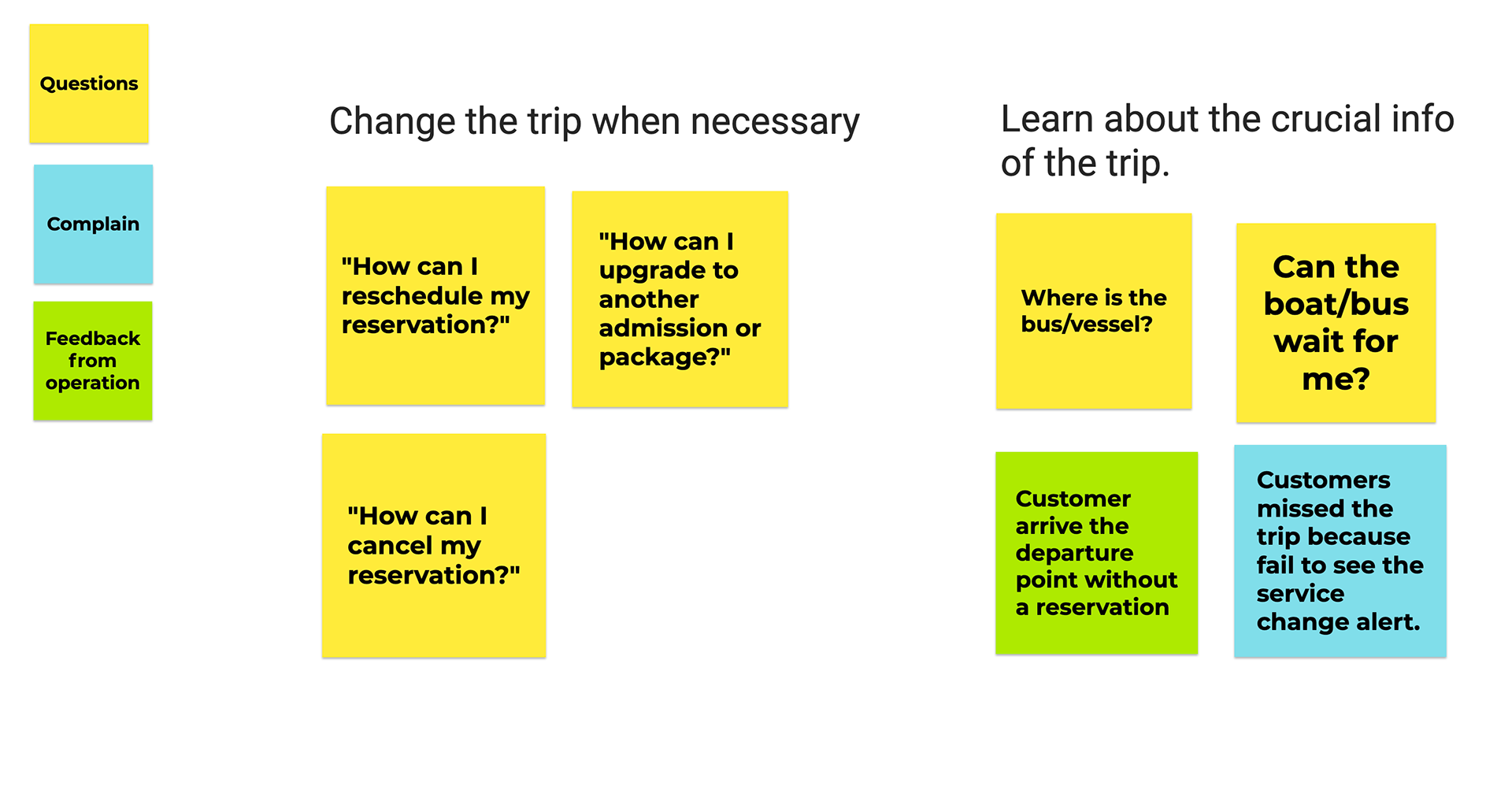
Questions from customers:
• How can I reschedule the reservation?
• How can I upgrade to another admission/package?
• How can I upgrade to another admission/package?
• Where is the bus/vessel?
• Can the bus/vessel wait for me?
Complains from customers:
Customers missed the trip because fail to see the service change alerts (which we posted on our website and social media).
Feedback from the operation department:
Customers sometimes arrive at the departure point without making a reservation.
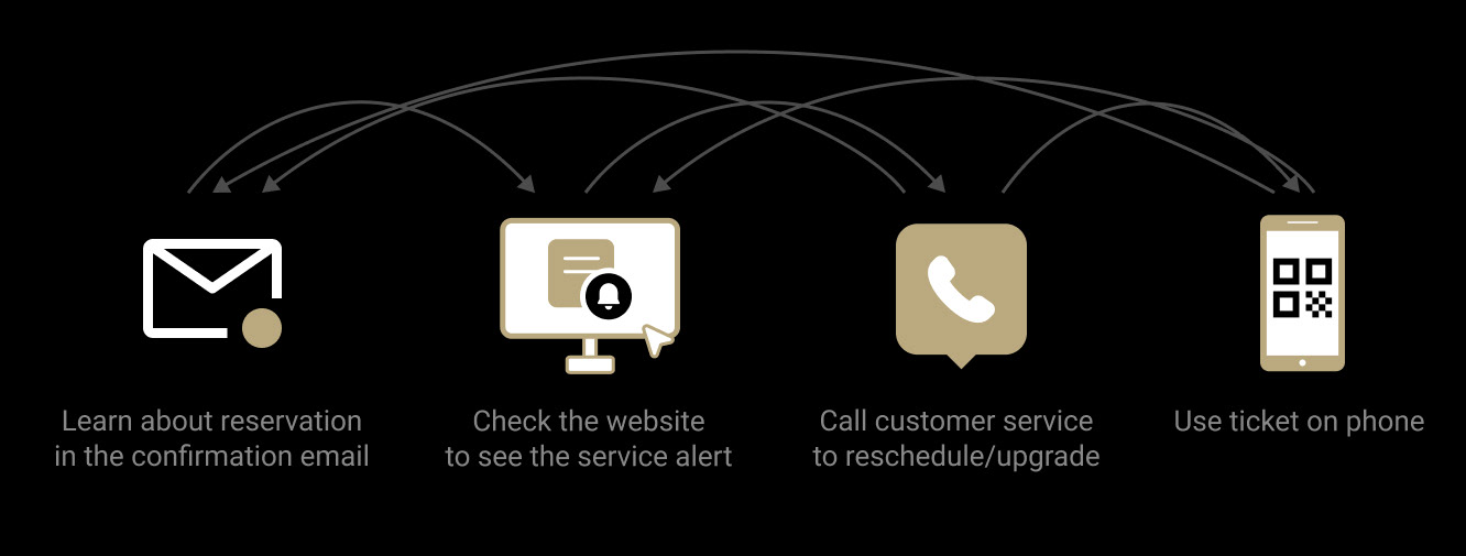
The old solutions were:
❓To reschedule or upgrade the package ➡️ Call customer service
❓To learn about the reservation requirement ➡️ Check the confirmation email
❓To learn about the service change alert ➡️ Check our website/social media
❓To learn about the service change alert ➡️ Check our website/social media
❓To check the location of the bus/vessel ➡️ Check our website
* * *
The management realized:
Having the solutions all over the place not only complicated the user experience but also added a lot of workload to the employees.
Therefore they decided to:
Consolidate all the solutions into one place, which is our app.
Their goals were:
• Fulfill all the user needs during the trip.
• Deliver crucial information about the trip more timely.
• Guide users to be more independent.
ANALYZE
At this point, I finally understood WHAT was I designing, but I needed to figure out HOW to design it. I decided to start with learning my users.
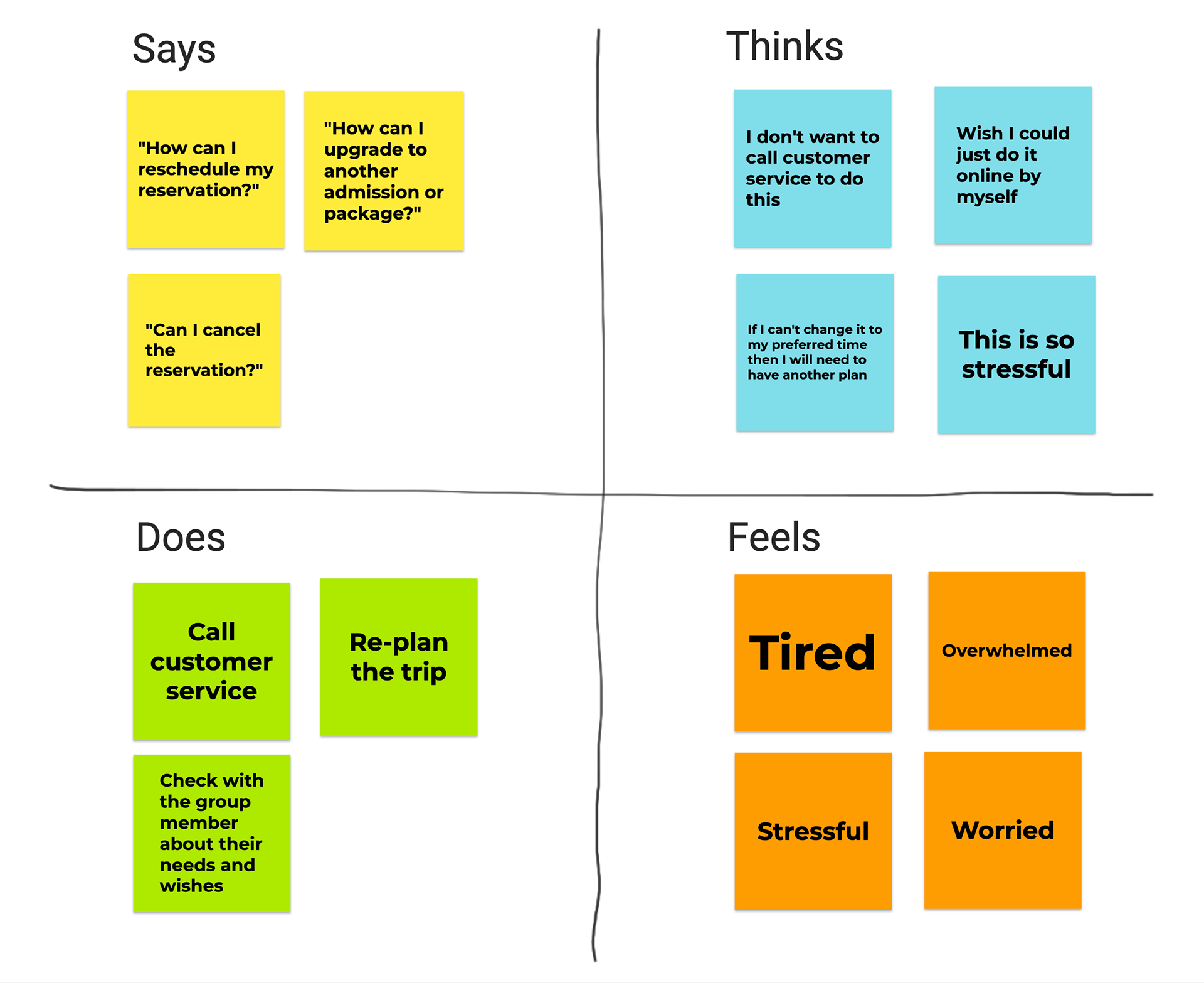
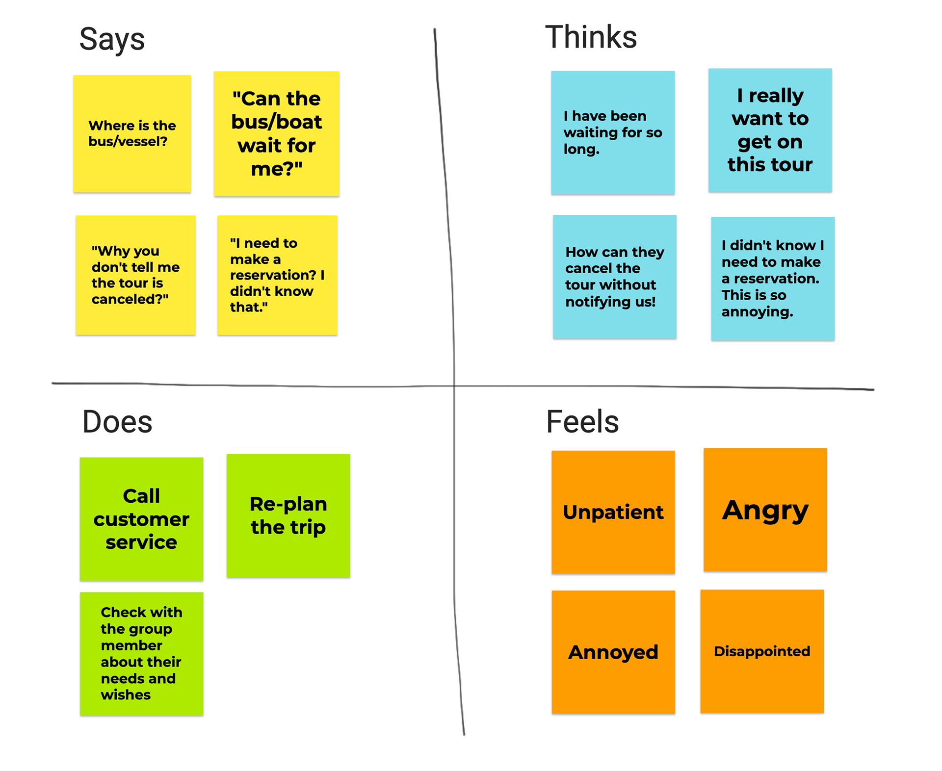
Empathize
First, I synthesized the feedback into 2 types:
1. Users want to make changes to the trip when necessary.
2. Users want to learn about the crucial info of the trip.
And then I created 2 empathy maps based on the 2 types of feedback.
Persona
According to our customer service, users who are older, first-time NYC visitor, non-English speakers need help most often.
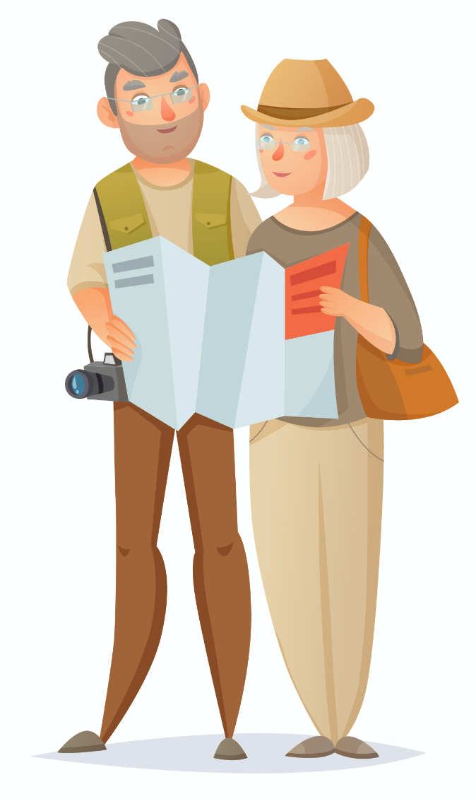
Name: Steve & Jane
Age: 50+
Nationality: Belgium
Education: Bachelor's Degree
Occupation: Retired
Goals: "We only have 3 days in NYC, we want to see the most iconic attractions!"
Frustration: "Our English is not so good, we don't want to call customer service."
Steve and Jane have been working very hard for many years. Now they finally get the chance to travel the world as they always wanted to. They are from a small town in Belgium, so they feel a little overwhelmed by a big city like NYC.
Problem Statements
I listed out several typical situations among users. Here is when things got clearer.
👱🏾♀️ As a first-time NYC visitor,
I want to know how to get to the destination easily,
so I won’t waste my time being lost on street.
* * *
👨👨👧👦 As a big family with complex needs and schedules,
we want to have the flexibility to change the trip,
so we can have a trip that makes all members happy.
🧕🏼 As a traveler who has a tight schedule,
I want to plan the trip as detailed as possible,
so I can enjoy my trip exactly the way I expected.
* * *
🧓🏻 As a visitor who only has 1 day in NYC,
I want to see most of the city,
so I won’t have regret when I leave.
User Journey
On this step, I noticed that users often feel nervous and uncertain during the whole process.
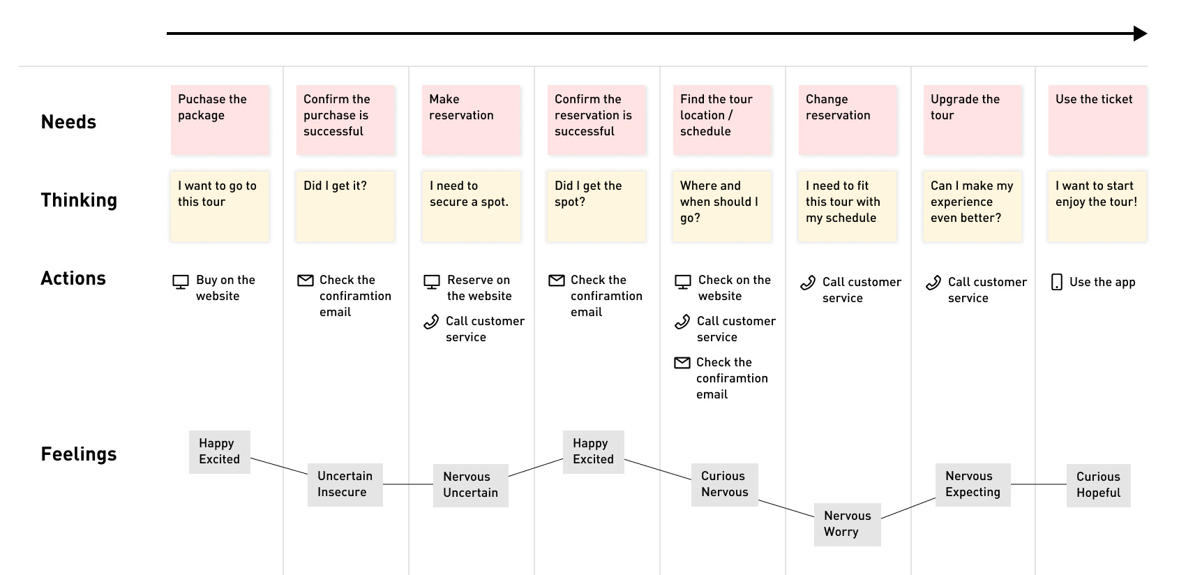
TAKEAWAYS
Pain Point 1:
Users want to have better control of the trip.
Users want to have better control of the trip.
They want to plan the trip based on their needs and at their pace
They want to avoid wasting time
They want to experience most of the city
Solutions:
Give more control = Show essential info and options.
Pain Point 2:
Many users are first-time NYC visitors, they would feel nervous and lost.
Solutions:
• Give users more guidance on how to complete the trips.
• Simplify the user journey.
• Offer more ways to contact us.
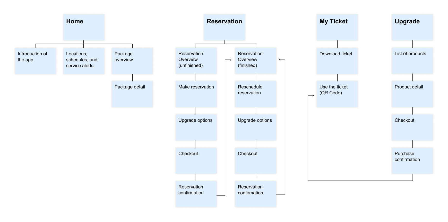
INFORMATION ARCHITECTURE
We decided to have 4 user flows to cover all the user needs
FINAL DESIGN
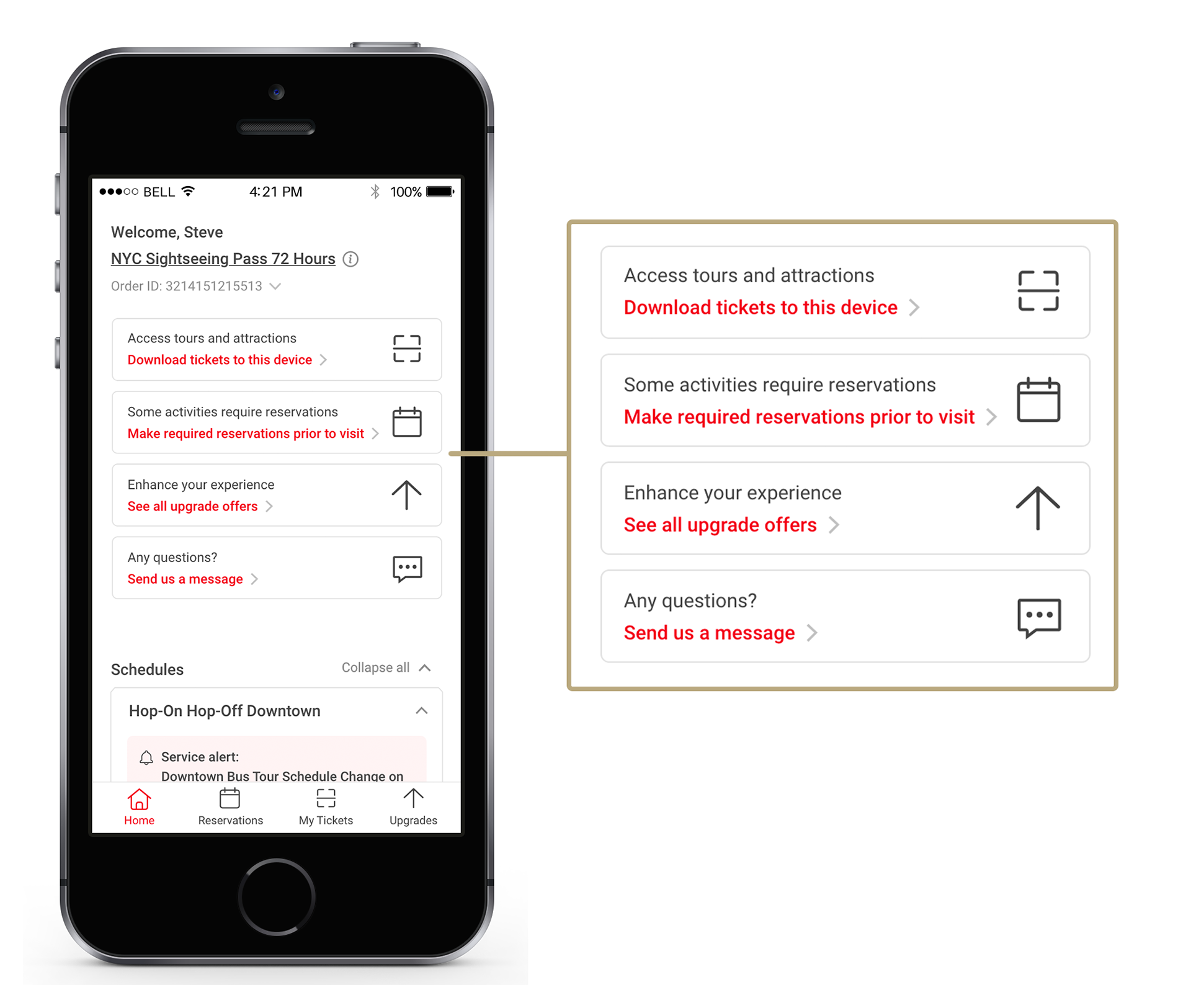
1. First sight: We decided to guide the users by showing a snapshot of the app.
Considering most of our users are first-time visitors, we decided to use half of the home page to educate users on what they can do with this app.
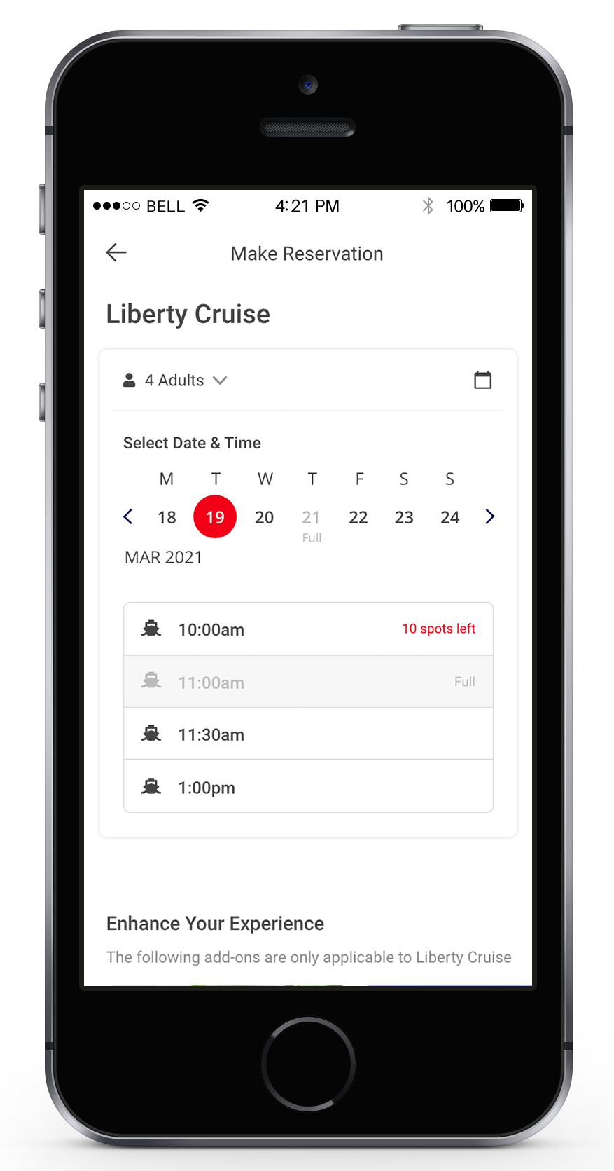
2. The full function reservation management.
Now users can make reservations, check reservation status, and change reservations by themselves.
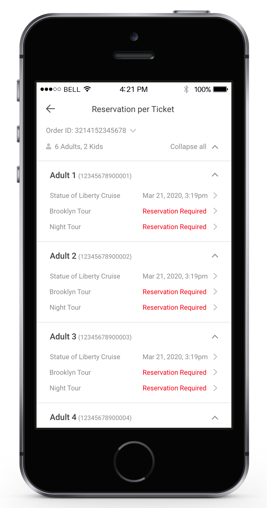
1️⃣ Reservation overview: The page clearly lists out all the reservations a user needs to complete.
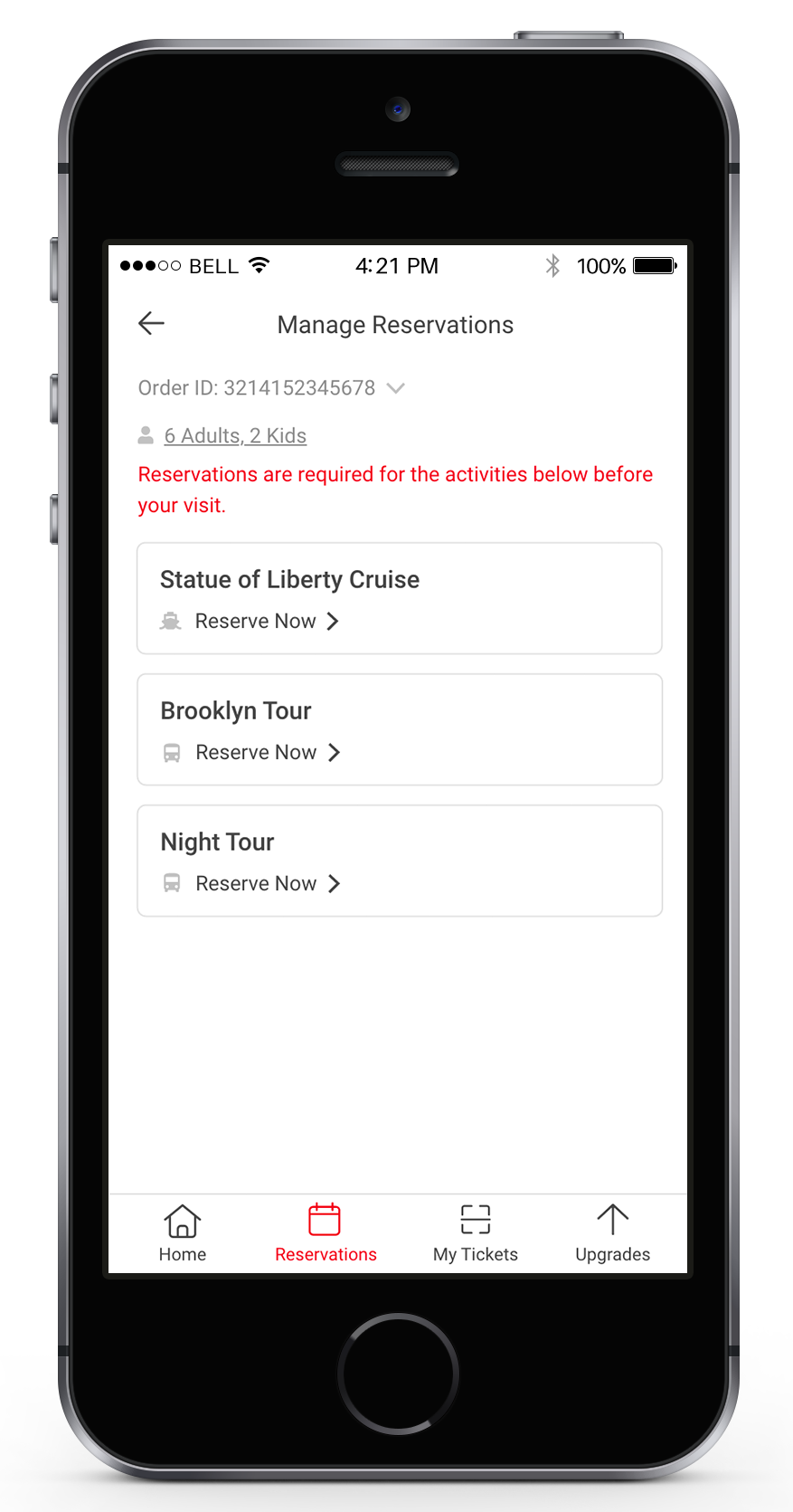
Reservation Overview
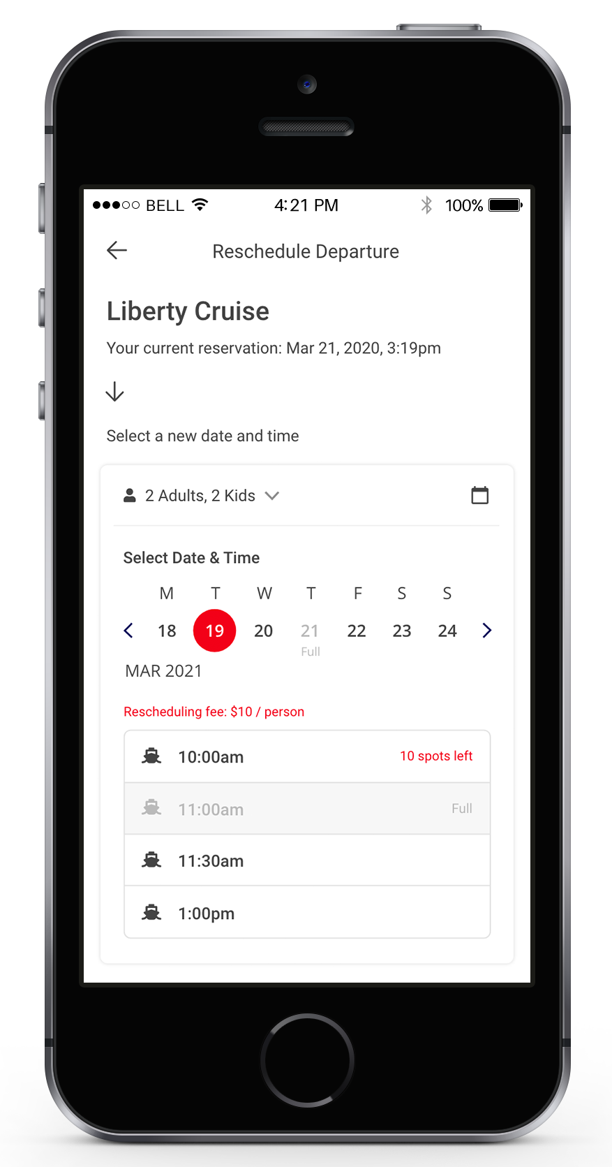
2️⃣ Reschedule: Users can reschedule the tour by clicking the reservation date.
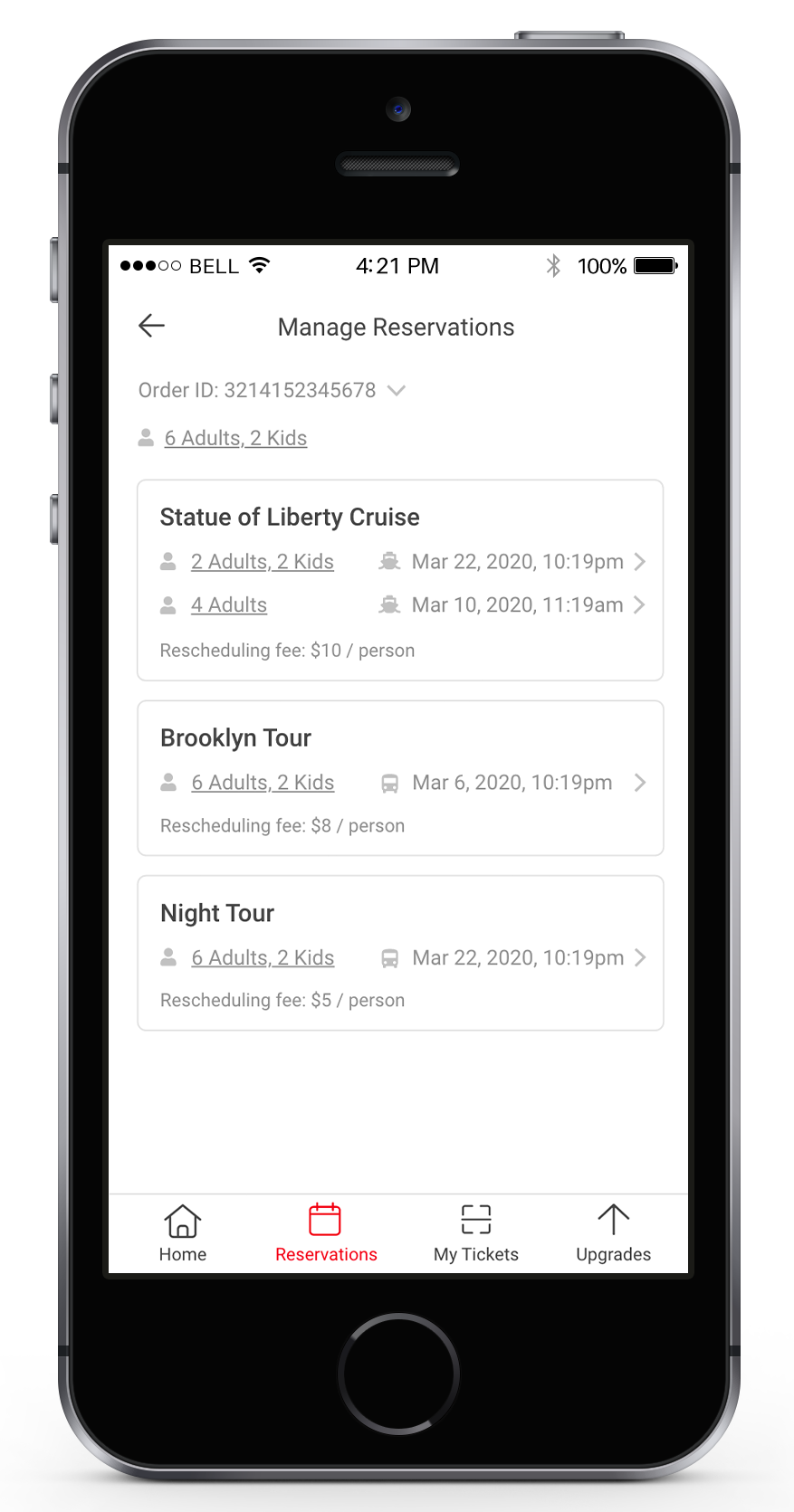
3️⃣ Another view: We also show the reservation status per ticket to help users plan their trips even better.
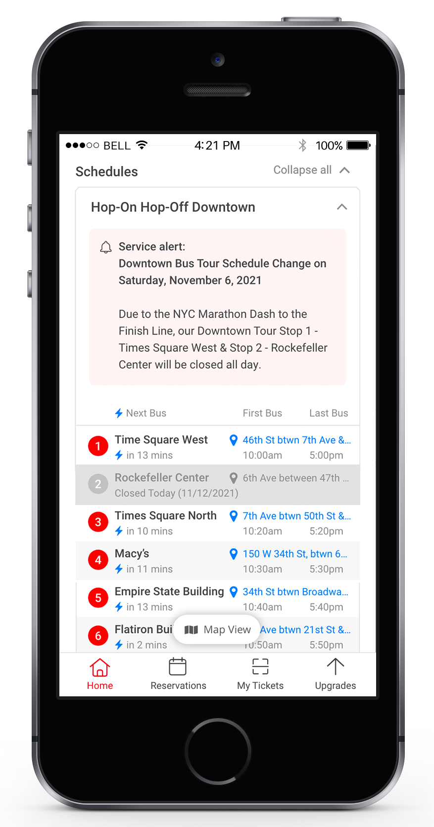
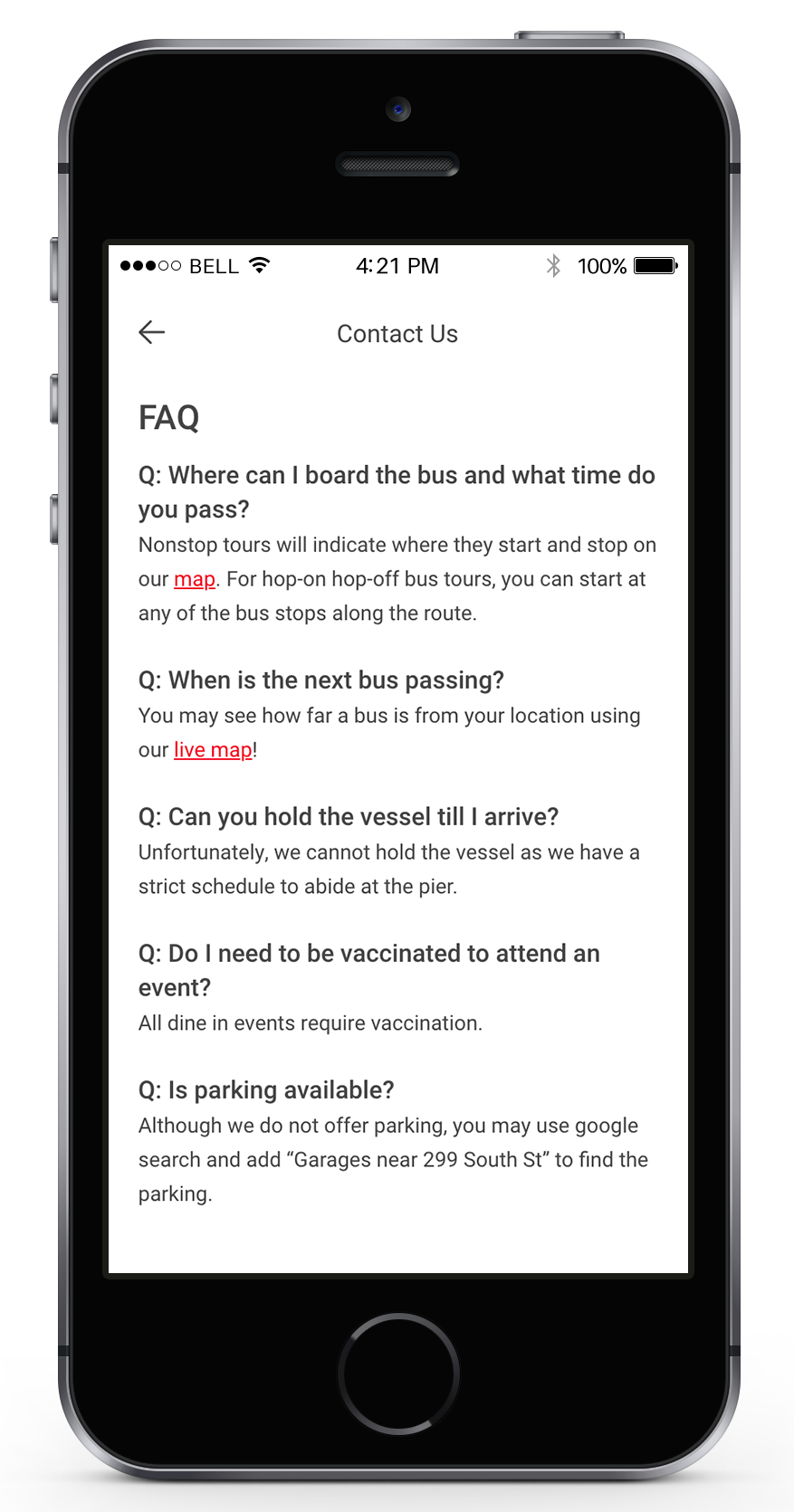
3. Show crucial trip info on the home page and FAQ page.
We not only help users to plan and control their trip, but also make the users become more independent and release customer service from the heavy workload.
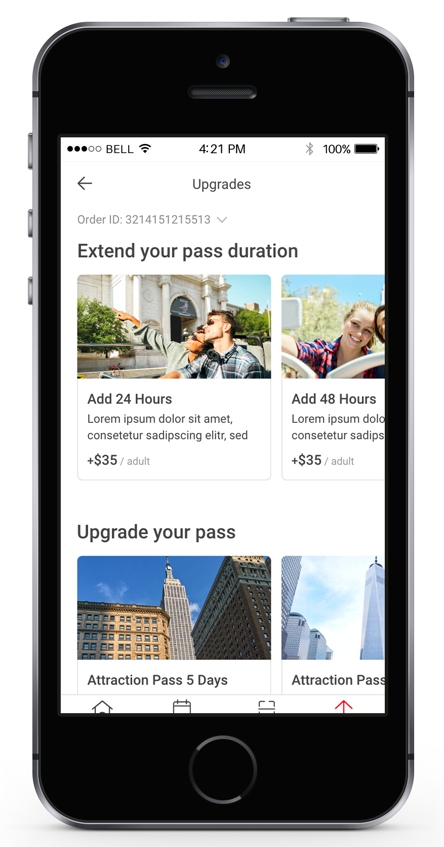
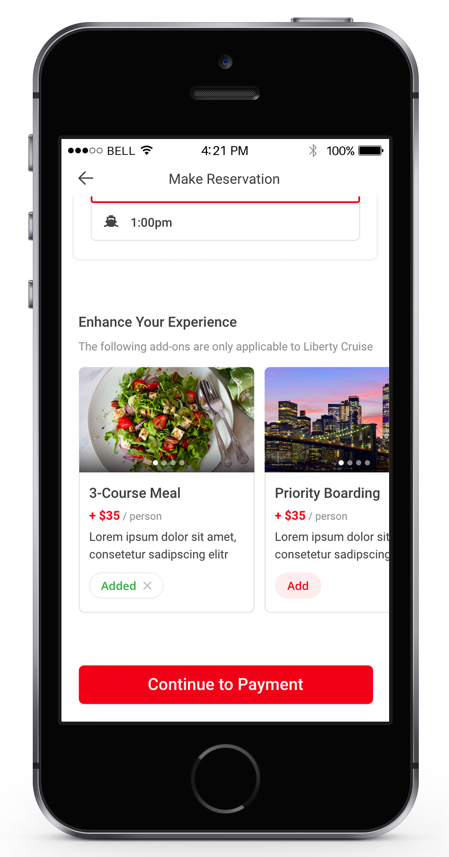
4. Offer upgrade options
We occasionally received questions from customers about if they can upgrade or switch to another package. We believe this is a great opportunity to both fulfill user needs and upsell more services.
Left: A full page of all upgrade options
Right: Upgrade options in reservation flow
FEEDBACK
Thank you so much for reading this far! Please feel free to send me any feedback! I would really appreciate it!
Thank you!